
Showing posts with label Chalks. Show all posts
Showing posts with label Chalks. Show all posts
Sunday, 22 April 2018
Foiled
Foil is everywhere at the moment, having a revival it seems, in the craft world. Time to pull my foils out along with other older supplies and create something new.

Thursday, 25 August 2016
A summer's Day at the Beach
Today I am showing a second piece of inspiration on the theme Hot summer days, chosen by my teammate Jane for the August Country View challenge.
I had to involve the beach... There is something about the sea, primeval maybe, that attracts and fascinates. The sound of crashing waves, the smell of salty air, the feel of sand under your feet... there's nothing like it!

First I played with acrylic inks on watercolour paper, stamping some images from the Retro Beach set (Rubber Dance) on top.

 Choosing a base of Kraft cardstock for my panel, I added some direct stamping in white pigment ink with the fisherman's net and black ink with the "Postcard" stamps from the same set.
I drew a sea and some sand with pastels.

The frame echoes the first stamped image, a square with script details.
I created it with thick cardstock and applied Grunge Paste (Paper Artsy) on top. After 10mns drying time, I then impressed a script stamp texture into it (ESN10 - Paper Artsy). When completely dried, I painted the frame with black acrylic and used Treasure Gold in Amethyst and White Fire to highlight the texture.
The "Dymo" labels, from the same Rubber Dance set, were stamped on glossy cardstock to give a more realistic effect.
 Finally, I placed a piece of muslin, micro beads and air dry clay seashells on the "sand" around the frame.
I hope I have inspired you to enter the Country View Challenges, you could win a £20 voucher to use on the Country View Crafts website!
Thanks for coming by,
 Also entering the SSS Wednesday, Penny Black and more, and Stamping Sensations challenges
I had to involve the beach... There is something about the sea, primeval maybe, that attracts and fascinates. The sound of crashing waves, the smell of salty air, the feel of sand under your feet... there's nothing like it!

First I played with acrylic inks on watercolour paper, stamping some images from the Retro Beach set (Rubber Dance) on top.

 Choosing a base of Kraft cardstock for my panel, I added some direct stamping in white pigment ink with the fisherman's net and black ink with the "Postcard" stamps from the same set.
I drew a sea and some sand with pastels.

The frame echoes the first stamped image, a square with script details.
I created it with thick cardstock and applied Grunge Paste (Paper Artsy) on top. After 10mns drying time, I then impressed a script stamp texture into it (ESN10 - Paper Artsy). When completely dried, I painted the frame with black acrylic and used Treasure Gold in Amethyst and White Fire to highlight the texture.
The "Dymo" labels, from the same Rubber Dance set, were stamped on glossy cardstock to give a more realistic effect.
 Finally, I placed a piece of muslin, micro beads and air dry clay seashells on the "sand" around the frame.
 I hope I have inspired you to enter the Country View Challenges, you could win a £20 voucher to use on the Country View Crafts website!
Thanks for coming by,
 Also entering the SSS Wednesday, Penny Black and more, and Stamping Sensations challenges
Sunday, 7 August 2016
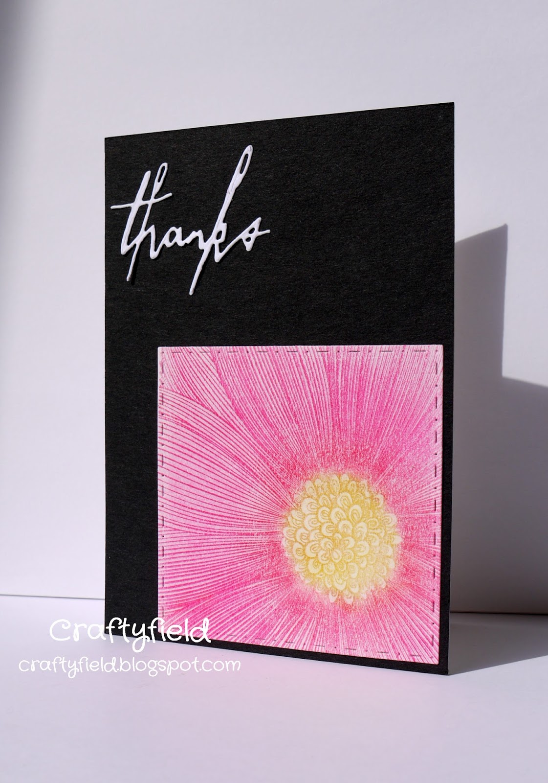
Black & White CAS
CAS doesn't need to have a white background... Looking at my previous makes I realised that my CAS were always on a white base so I have decided to push myself into new colours. Today I have gone to the opposite on the spectrum with black, and it shows off my pink flower to best effect.

The flower is the Dahlia from the Colour me collection by IndigoBlu and the die-cut is from the Thinlits Sentiment words set by Tim Holtz.
I stamped the flower with Versamark and applied chalk pastels in different shades of red and pink over the petals and yellow for the center.
Thanks for coming by,
I am entering the IndigoBlu, SSS Wednesday, Penny Black and more , Stamping Sensations and Uniko Studio challenges
Wednesday, 10 February 2016
3 is better than 1
Today I am guesting over at the Rubber Dance blog with a Valentine inspired make.
I can't resist photo realistic stamps so I couldn't wait to ink the Nostalgic Couples set from Rubber Dance. And one image wasn't enough... so how do you fit more than one image on a card?
I found the solution in the form of this Accordion die (Crafters Companion). I chose to have 3 panels but you can add as many as you want!

From left to right the 3 chosen images are organised in a chronological order, young (courting), older and married, older still, but together!


Each of the image has been stamped with Versamark and I applied chalks (pastel) on top in red and black. Once finished I cleaned up some of the stray powder using blue tack..
I added a heart border (Docrafts die) and some white embossed words/motif from the same Nostalgic Couples plate.
Many thanks to Bibi for having me on her blog, I thoroughly enjoyed it!
Happy Valentine's!
I can't resist photo realistic stamps so I couldn't wait to ink the Nostalgic Couples set from Rubber Dance. And one image wasn't enough... so how do you fit more than one image on a card?
I found the solution in the form of this Accordion die (Crafters Companion). I chose to have 3 panels but you can add as many as you want!


Each of the image has been stamped with Versamark and I applied chalks (pastel) on top in red and black. Once finished I cleaned up some of the stray powder using blue tack..
I added a heart border (Docrafts die) and some white embossed words/motif from the same Nostalgic Couples plate.
Many thanks to Bibi for having me on her blog, I thoroughly enjoyed it!
Happy Valentine's!
This Accordion card is entering the Live and Love crafts, Tando Creative and Penny Black and more challenges.
Monday, 18 January 2016
Vintage inspiration
My favourite theme being Vintage, I was inspired by both the Vintage Journey and the We Love Vintage challenges. The first has a theme of travel and the second... not entirely sure as Google translate let me down and, despite having spent inordinate amounts of time in the Netherlands, the Dutch I picked up could be written on the back of a (small) envelope. Actually strike that, since I wouldn't even know how to write the few words I did learn!
Anyway, I think it had something to do with lace and an edge, I hope I have fulfilled the remit, if not, you have my apologies.

For my background I used a Tim Holtz/Sizzix embossing folder (Eiffel Tower), inked up with Distress inks, sprayed lightly before running through the die-cutting machine. Such an easy technique for a colourful background! I added highlights with chalk for more variety as my base cardstock (kraft colour) is quite dark.
My focal image had to be from the The Journey stamp set (Stampers Anonymous CMS021) and I used Distress inks to age it.
For embellishments, in addition to the lace, I added some Calico Crafts gears/cogs and a DIY cog I embossed with a mix of embossing powders.
Thanks for coming by,
Also entering the Artistic Stamper, We Love To Create challenges.
Monday, 11 January 2016
Metal and chalk
Tim Holtz is reviewing some of his "old" techniques in his 12 tags of 2016 and January is a very industrial mix of metal and chalkboard. I was inspired to try ...
For a complete step by step I will refer you to the master over here as I followed the steps fairly closely. My focal image, stamped on black cardstock, is an image by Katzelkraft, or rather a very small portion, and represents a helicoidal clock, which I thought could be suitable for a Steampunk vibe.
 I tried to make it stand out a bit more by popping up the spiral with increasing heights of foam pads but not enough to show in the picture.
To emboss the tag I used a Docrafts Plaid embossing folder, as on metal I thought it looked industrial.
I replaced the metal embellishment by an embossed word on the same black cardstock as I felt I needed that extra contrast of stark white against black with the rest of the tag being so grey! (Yes I know it looks blue in the photo.... the weather is just not cooperative and the natural light is hard to come by)
Thanks for coming by,
For a complete step by step I will refer you to the master over here as I followed the steps fairly closely. My focal image, stamped on black cardstock, is an image by Katzelkraft, or rather a very small portion, and represents a helicoidal clock, which I thought could be suitable for a Steampunk vibe.

To emboss the tag I used a Docrafts Plaid embossing folder, as on metal I thought it looked industrial.
I replaced the metal embellishment by an embossed word on the same black cardstock as I felt I needed that extra contrast of stark white against black with the rest of the tag being so grey! (Yes I know it looks blue in the photo.... the weather is just not cooperative and the natural light is hard to come by)
Thanks for coming by,
Saturday, 24 October 2015
Good Luck
If the Craft Barn is not your local craft shop, you may not be aware that the physical shop has closed last weekend to become an online retailer exclusively. So, the challenge this week is a bit special and, whilst last week the Craft Barn DT was using Impression Obsession Cover A Card background stamps, our challenge is to make a Good luck card.
Still, I was intent on using my own Impression Obsession stamps which are one my favourite brands...
In a departure from my usual makes this is an hybrid project where I combined the rubber stamped image (I stamped the IO Ornate stamp with Versamark and used soft pastels on top in several shades of blue and turquoise) and digital elements in the form of a poster and a sentiment.
 So there it is, wishing the Craft Barn all the best for the future whilst trying to keep calm about not getting my usual crafting fix at the shop, since I can still Keep on shopping...
Still, I was intent on using my own Impression Obsession stamps which are one my favourite brands...
In a departure from my usual makes this is an hybrid project where I combined the rubber stamped image (I stamped the IO Ornate stamp with Versamark and used soft pastels on top in several shades of blue and turquoise) and digital elements in the form of a poster and a sentiment.

Saturday, 8 November 2014
Hot & Spicy with a touch of bling
In the sea of Christmas colours, That's Crafty's challenge would like to see hot colours, well that's a relief...

For my hot background I used linen card with pastels ,applied in an ombre fashion.
Before die-cutting my circle, actually a clock face from Papertrey Ink, I applied double sided tape to my cardstock. Then I used gilding flakes over the sticky side for a bit of bling.
I added a touch more bling on a black flag (partial die-cut of an Impression Obsession die) by stamping with glue before gilding.
The central image is by Crafty Individuals and I stamped it with black and silver inks. The silver was applied on the cage part of the image but it wasn't very successful. I later added a bit of silver gel pen .
I coloured flowers and bird with watercolour pencils and a waterbrush.
My flower embellishments are pieces of fabric dyed with Inktense, folded, stuck and twisted with a piece of netting.
I die-cut my bouquet flowers (Papertrey ink) and enhanced them with the matching stamps.
I was going to add more bling in the form of gems but, as per usual, couldn't bring myself to do it!
I am also entering the Pan Pastel and Wedodoobadoo challenges.
Thanks for coming by,
Sunday, 31 August 2014
Je vois la vie en rose... Deja vu!!!
Wow 2 clichés in the same title, both French to boot, I am on a roll...
If you are working backwards in your blog feeds, you won't have seen my first pink creation, feel free to go there first if you like pink! The colour is inspired by the Pan Pastel UK challenge.
Since I bought the Eiffel Tower embossing folder (Sizzix by Tim Holtz) I want to use it on everything, so when the Wedodoobadoo challenge required textures it's the first thing I pulled out.
I mixed some texture paste with pastel and applied it fairly smoothly to my cardstock. When dry, I run it through my die-cutting machine with the folder.
Do wait until the paste is dry, otherwise the paste goes in the folder and the cardstock disintegrate as you try to pull it out. Don't ask how I know...

I then applied different shades of pink as well as a bit of white pastel over the raised areas , picking out the fleur de lys as a good spot to foil in pink and gold foil (it looks dark but that is a reflection).
The texture paste is a lovely ground for pastels by the way, it is smooth but grabs the powder very effectively.
I couldn't bring myself to cover it with anything, so whilst I pondered what to do with it I made my second pink textured creation which I posted previously.
With no further inspiration coming through, I just matted the panel on some pink cardstock and left it at that. Surely it would be futile to try and improve on TH design ?
I am all pinked out now,
Friday, 29 August 2014
Je vois la vie en rose...
If you abhor pink turn away now... but pink is what Pan Pastel UK want to see so I have made an all out pink panel with lots of textures using different media.

I prepared my background with gesso and scribbled some Inktense then sprayed with water.
I used stencils and texture paste that I coloured with pastel and sprinkled various pink mediums: glitter, micro beads, embossing powders. The micro beads were difficult to handle as, in order for the paste to hold them, they have to be squashed somehow but without compromising the stencilled motif underneath. Also, they have to be sprinkled quickly and they get everywhere, jumping and rolling far far away...
Then I created a bouquet with stamps and matching dies (Papertrey ink), wrapped it in a bit of mulberry paper and added a butterfly from my stock of previously made embellishments. (It has a stamped cardstock base and a vellum layer sewed at the butterfly's body).
I am also entering Wedodoobadoo and Lisa.B. Designs challenges.
I should warn you that before I settled on this design, I explored another pink idea which I will show in my next post.
Pink haters look away now...
Thanks for coming by,
Friday, 11 July 2014
Clean and simple... Roses
Roses are a girl's best friend, at least for the Pan pastel UK challenge!
Excellent reason to pull out my 3 steps stamping roses. Except this time I did only 2 steps...
 To get that velvety look on my main bloom (the darker one) I used pastel on Versamark.
I stamped once and applied the darkest shade of pastel, then stamped the second step taking out some of the pastel. Using that stamp now covered with both Versamark and pastel I stamped the lightest rose in the corner.
I returned to the first rose and applied a lighter shade of pink (I know it looks red but in real life it's more pink).
Finally I should mention that I used negative masks to stop the pastel spreading everywhere. Hence the light pink around the rose is pastel that stuck to un-inked card within the mask. A third step that I got for free if you like!
The leaves were stamped with ink.
Thanks for coming by,
Excellent reason to pull out my 3 steps stamping roses. Except this time I did only 2 steps...

I stamped once and applied the darkest shade of pastel, then stamped the second step taking out some of the pastel. Using that stamp now covered with both Versamark and pastel I stamped the lightest rose in the corner.
I returned to the first rose and applied a lighter shade of pink (I know it looks red but in real life it's more pink).
Finally I should mention that I used negative masks to stop the pastel spreading everywhere. Hence the light pink around the rose is pastel that stuck to un-inked card within the mask. A third step that I got for free if you like!
The leaves were stamped with ink.
Thanks for coming by,
Saturday, 24 May 2014
Floral Passion
Time for the Craft Barn quote challenge! This week I chose the word passion, whilst the colour scheme was supplied by A Sprinkle of Imagination (I used Aqua, Pale Lime, fuschia and purple) and the Floral theme by Pan Pastel UK.
As for the technique, I went back to my all time favourite, pastel on top of Versamark. Not only this method allows multi-coloured stamping in a much easier way than inks, but the colours are also much more vibrant, solid and velvety.

I stamped flowers and leaves without masking (Papertrey Ink), which is why some of the overlaps aren't quite as good as I would have liked. After applying the different shades of pastels I cleaned up around the images with an electric eraser.
I will repeat myself here for the benefit of my new readers that may not have tried the Versamark and pastels/chalks technique: it is fool proof, the results are fantastic and it needs to be seen in real life to be fully appreciated. You can see another example here and here.
Thanks for coming by,
Saturday, 29 March 2014
Inspired BY Pam Thorburn (3)
Pam is back on the PaperArtsy blog this week and had a play with the gorgeous Chatsworth papers.
As soon as I saw her layout I knew I had to make one of my own; well that and the fact I have a stack of photos waiting...
+Lowres.jpg)
s I followed Pam's step by step so I will give here details of where I diverted:
My backing paper is an unloved scrapbook paper that I painted white around the sides, just enough to knock back the printed motif and the dark brown colour.
The main paper started as a dark red 12x12 with an all over damask pattern. I used stamps with pigment inks to ape the Chatsworth papers feel, applying pastels on top where it took my fancy. I also stamped the Reflection stamp (ESN07 stamp set) in dye inks in a few places but a lot of this disappeared behind the photo.
My embellishments are different of course and I spent an inordinate amount of time trying to create with dies my metallic lacy flowers. I didn't count the number of passes or shims combinations I tried but it was A LOT!
For texture I used 2 stencils instead of one, I had the chicken wire but in the smaller size so decided to add the hexagons as they are the right size. I coloured the stencilled areas after they dried because I wasn't happy with the green colour I had originally mixed.
Finally, I couldn't quite push myself to include as many embellishments that Pam did! In my defense, I thought pearls would look a bit odd teamed with a "man"'s photo...
Don't be shy tell me what you think,
Friday, 21 March 2014
Spring is here...
Digital images are becoming more and more popular as is digital crafting or hybrid crafting. Personally I like handling my stamps directly and not being restrained in my techniques either by the ink used or the surface I am stamping onto. Still, I can see the appeal and thought I would better try for myself.
Uniko Studio provided freebies to enter their Hello Spring challenge and I selected the Simple Bloom flower and a speech bubble and sentiment. Using photo editing software I combined them and printed the resulting image on smooth cardstock.
For colour scheme I followed the Pan Pastel challenge to use 6 colours and used the palette below, also proposed on the Uniko Studio:


As a background I wanted to use a stencil I made with a Memory box die and initially thought I would use Distress inks but in the end I didn't have enough colours. Instead I used Versamark and applied pastels over it gradating from the darkest blue to the lightest and vice versa for the green.
I over stamped with the 3 Dandelions stamps (Lavinia) in black Versafine and coloured the printed image with coloured pencils.
With hindsight I wish I had done the green gradation lighter or even faded it out to the bottom and I feel the dandelions are not best placed but I do like the fact it is only one layer.
Don't hesitate to suggest improvements in your comments!
Uniko Studio provided freebies to enter their Hello Spring challenge and I selected the Simple Bloom flower and a speech bubble and sentiment. Using photo editing software I combined them and printed the resulting image on smooth cardstock.
For colour scheme I followed the Pan Pastel challenge to use 6 colours and used the palette below, also proposed on the Uniko Studio:
As a background I wanted to use a stencil I made with a Memory box die and initially thought I would use Distress inks but in the end I didn't have enough colours. Instead I used Versamark and applied pastels over it gradating from the darkest blue to the lightest and vice versa for the green.
I over stamped with the 3 Dandelions stamps (Lavinia) in black Versafine and coloured the printed image with coloured pencils.
With hindsight I wish I had done the green gradation lighter or even faded it out to the bottom and I feel the dandelions are not best placed but I do like the fact it is only one layer.
Don't hesitate to suggest improvements in your comments!
Friday, 14 February 2014
Inspired by Lin Brown
This week Julie Ann showed her gorgeous box full of wonderful details on the Paper Artsy blog. Didn't have the courage to try myself...
 Paper Artsy has new stamps coming out soon and we were treated to a reveal of the latest Eclectica products designed by Lin Brown, along with some samples by the DT.
I fell in love with this one and attempted my own version, with the old stamps, of course !

The support is a piece of cardboard onto which I glued/gessoed a piece of cotton.
For the background, inspired by the Pan Pastel DT who was mixing pastels with all sorts of acrylic mediums, I tried mixing pastel with acrylic paint and created a pink and a green paint.
On top I used a very old stencil of a flower with white, Claret and Limelight paints in different mixes.
I stamped in Aubergine chalk ink (might as well carry on the "chalk" theme) 2 stamps from the ESN07 set for a bit of background interest.
Then, the piece de resistance... this is a technique I am already familiar with and in fact my top favourite, but I had never tried it on fabric as shown by Tracy here for the Pan Pastel UK challenge.
I stamped with Versamark the Tulip from the ELB03 set and the foliage from ELB02.
Then, I applied pastels over the Versamark, using different colours for variation.
I cleaned up the Tulip head with an electric eraser where the pastel shouldn't be but left the rest with this slight haze of pastel. The texture of the cotton grasped more pastel than cardstock does but I liked the effect.
Finally I used a charcoal pencil to create a shadow on the tulip.
I enjoyed the process very much and I am quite happy with the result, for once!
Thanks for coming by,
Sunday, 3 November 2013
Art Journal Letter N & fifty shades of grey
I just chose the title to entice readers... but my post isn't titillating in anyway, unless crafting is your thing!
I wanted to join the Craft Barn challenge and have a play... I knew I wanted to use pastels this time and a Tim Holtz stamp, so I chose my word accordingly: Nostalgia. And since I was using pastels, I thought I would join the Pan Pastel challenge which gave me the colour scheme.

Throughout the page I have only used the pastel over Versamarked images. I used the Grunge background stamp (Impression Obsession) as a border all around the page, the Canvas stamp (also IO) and a Hero Arts flourish background. I varied the shades of grey from light to dark and cool to warm.
Then of course my chosen Tim Holtz stamp, for which I allowed myself a pop of red for the bellboy's jacket and hat, as it gives the image focus and creates a bit of excitement in an otherwise grey page...
At this point I used an electric eraser to recover some of the white for the "Victoria" and the bell boy's face.
I then used a number of small filler stamps with dye inks, sometimes mixing colours directly on the stamps.
Hope you like this one,
Sunday, 23 June 2013
Colors of summer
This is the theme of the challenge atImpression Obsession. I chose to make a layout with some vintage photos, involving a summer dress that I imagine in bright colors of red, pink, yellow and blue against a fresh white. Not unlike the small strip of floral print material I stuck on the bottom left of the page.

Thanks for coming by,

I have used some of my newest IO stamps and dies, the Dress Form Trio (F13086), Tag set (3119-SM) and Flags die set (DIE015-F), Rose Print Background (F8867). The stamped images have been chalked so that the colors would actually be visible on the fairly dark blue background.
The base cardstock has a white core and I took advantage by embossing corners and borders. The mat behind the single dress form (fussy cut) is a Scalloped Nestie that I have punched with a long reach butterfly punch.Thanks for coming by,
Monday, 11 March 2013
Favorite technique
Time for a new challenge at Impression Obsession on the theme Favorite technique.
Choosing the technique was easy, and so was making the background with the technique. The next stage however...
As per usual, once I had done the background, I didn't want to hide it because I thought it so beautiful. Eventually I decided to use the same stamp in a contrasting color as a topper for my card. I tried gilding flakes on dark blue card, which, predictably looked a mess (detailed stamp + bonding powder is not a good combination), moved on to mica powders on dark blue, pretty, but I realised dark blue was never going to work with my background's blues !
Then lightbulb moment.... I reversed the color scheme and embossed the stamped image in white, applying watercolor on top. I had several tries with that too... and concluded that to get good results watercolor paper was an absolute necessity. To make my topper more interesting I die-cut it with a Spellbinders Accent die, added a ribbon with a rub-on greeting and some heart gems.

Now for the technique : the background is CAC Ornate (CC077) stamped in Versamark, then colored with pastels (chalks) using cotton balls. I used 3 pastel sticks in dark indigo, ultramarine blue and a vibrant violet, concentrating the dark indigo on all 4 sides of the background. I sprayed a bit of fixative to avoid smudging.
This is the same technique as the one I used here
I encourage you to try this technique, it's foolproof and the results are so beautiful...
Choosing the technique was easy, and so was making the background with the technique. The next stage however...
As per usual, once I had done the background, I didn't want to hide it because I thought it so beautiful. Eventually I decided to use the same stamp in a contrasting color as a topper for my card. I tried gilding flakes on dark blue card, which, predictably looked a mess (detailed stamp + bonding powder is not a good combination), moved on to mica powders on dark blue, pretty, but I realised dark blue was never going to work with my background's blues !
Then lightbulb moment.... I reversed the color scheme and embossed the stamped image in white, applying watercolor on top. I had several tries with that too... and concluded that to get good results watercolor paper was an absolute necessity. To make my topper more interesting I die-cut it with a Spellbinders Accent die, added a ribbon with a rub-on greeting and some heart gems.
Now for the technique : the background is CAC Ornate (CC077) stamped in Versamark, then colored with pastels (chalks) using cotton balls. I used 3 pastel sticks in dark indigo, ultramarine blue and a vibrant violet, concentrating the dark indigo on all 4 sides of the background. I sprayed a bit of fixative to avoid smudging.
This is the same technique as the one I used here
I encourage you to try this technique, it's foolproof and the results are so beautiful...
Saturday, 8 December 2012
Calendar Challenge Week 10
I can hardly believe I have done 10 pages already for my calendar ! This week, we must use Trees on our pages for the Craft Barn challenge. I have lots of tree(s) stamps, so the most difficult was to choose ! Based on size, I settled for the Cover-a-card Branches by Impression Obsession. If you are a frequent visitor you will be aware that I love it !

I used pastels to establish a sky and ground backdrop for the Branches. I stamped the image with my wettest ink, Aubergine Versamagic, to best capture the details of that stamp.
I stamped and embossed the "Hug a tree" sentiment (Crafty Individuals) at the top.
The "frame" has been dry embossed with 2 sizes of Spellbinders dies, then wet embossed. The embossing is not perfect but I wanted a rustic look anyway.
Had I not used leaves in my last page, I would have added some... but I didn't want to repeat myself, so I just added a bit of twine on the calendar itself, less is more and all that...
Thanks for coming by,
Saturday, 1 December 2012
Calendar Challenge Week 9
This challenge is colour based and the Craft Barn asks us to use the Rust/Teal/White colour scheme.
My submission below has been coloured with distress inks and is my second try :

 Now as to my first try.... Since Pan Pastels have burst on the craft scene, I have wanted to test colouring card with traditional pastel sticks, which although less practical and more messy than Pan Pastels, should be the same thing at a fraction of the price.
I have found that :

I will definitely try again !
Let me know what you think... of pastels, Pan Pastels and/or my page !
My submission below has been coloured with distress inks and is my second try :
I have first stamped and embossed the script stamp and the Postmark stamp in clear powder, the main stamp in black embossing powder before applying the distress inks.
To finish, as it's a September page I added some leaves. I played alchemist and made up some copper paint and aged it with salt and vinegar as you can (hopefully) see here:
I have found that :
- it's easier to achieve a smooth application compared to the Distress inks.
- to get dark tones use very dark pastels as card is too smooth to grab lots of pastel, I didn't and the result was too pale (this is why I changed tack).
- over the embossing the pastel behaved quite strangely as you can see in the detailed shot below. Unexpectedly the pastel stuck MORE to the embossing and this can be seen clearly on the area to the left in rust colour. However the pastel can be removed with a clean cloth, a little or a lot. If a little, the embossing looks fuzzy (no it's not the photo), an effect which I liked.
I will definitely try again !
Let me know what you think... of pastels, Pan Pastels and/or my page !
Subscribe to:
Posts (Atom)