Wednesday, 4 May 2016

Botanicals

I love this month Rubber Dance's challenge colour scheme, perfect for a Vintage feel and my choice of stamp, one of the images from the Antique Botanicals set designed by Katy Leitch for Rubber Dance.

My make is being shown off on the Rubber Dance blog as I am honoured to be guesting again!


The background is a 6x6 paper from a Melissa Frances pad, which I have distressed with ink and stamped with portions of the text image from the Collage Mix plate.

I colour matched a white doily (well half a doily!) using Distress inks to the blue of the challenge.

Embellishments:
A piece of vellum (Lakeland I believe-yes THAT old!), a piece of muslin, a piece of ribbon, a wood impression button (Trimcrafts Curiosity Corner) and some die-cuts.
I stamped the Camellia and  the small flower with Walnut Distress ink, after eliminating the Versafine in Sepia for lack of oomph. --- I do wish Versafine would come up with a dark brown!---

Anyway... Distress ink is not the best for detailed stamps so I was quite happy with the results, as the impression is still very good despite using Distress.

I used coloured pencils (Derwent) on the Camellia.

I decided I wanted to have some vellum (love the stuff, have loads but hardly use it) and cut a fishtail banner to place underneath my image.

Finally I decided to machine stitch a few elements in place and add a stitched border for extra interest.


I do hope you will like my card and are inspired to join the challenge at Rubber Dance.

Thanks for coming by,
  I am entering my card in the Penny Black and more, Stamping Sensations and Live & Love Crafts challenges

Tuesday, 3 May 2016

Just add shine!

Today I am back on the Country View Challenges blog for a second Stencil inspiration piece .
Look at the shine on this... lots of mica involved!


My previous creation was made with lots of DIY stencils but for this one I have only used bought ones.


As a test, I made a rubbing with an orange wax crayon to create a resist for the later stages. Orange I hear you say...in my defence this is all that is left after being kid-handled...
 
Then I used the stencils with sprays


I am mixing brands and the design you see here is technically a mask, not a stencil!


After drying the sprays I moved on to inks, Distress for darks and white pigment for lights.


Lastly, I used a stencil with coloured texture paste. It looks grey when wet but it dries dark grey, very close to black.


For the finishing touch I used Treasure Gold in White Fire, Amethyst and Onyxite on the raised texture.


I added the Finnabair figure (Prima) as a focal image, stamped on mulberry paper, I darkened the borders with a black pencil, added butterflies (Calico Crafts), a piece of muslin and mounted the whole thing on a sturdy piece of cardboard to flatten it.


I do hope I inspired you to dust off these stencils and maybe try a new technique/media with them! Come and show us at Country View Challenges for a chance to win a £ 20 voucher.

Thanks for coming by,
Also entering That's Crafty, Stamplorations and We Love To Create challenge

Sunday, 1 May 2016

Layered Stencil

Today we are kicking off the new challenge at Country View Challenges with the theme of Use a Stencil.

Also, alongside our Challenge, we are running a Blog Hop with a Sizzix Big Shot Machine & Die Bundle as the prize. To enter, you must be a Follower of our Challenge Blog and Hop along to each of our Design Team Members Blogs and leave a comment. We will still be running our normal monthly challenge and those who link their Use A Stencil projects will also be entered into our £20 Voucher draw. The Winners will be picked at random in early June.

I am first in the hop
Christine   ------> You are here!
Gabrielle
Jennie
Rachel
Sue
Evelyn
Doreen
Nikki
Monika
Hazel
Brenda
Corrie
Jane

Lots of possibilities with stencils and, for this first project, I wanted to use "flat" techniques with the stencils. [It turns out later that I couldn't resist a bit of dimension..]


You can use stencil as a resist with a variety of mediums that all work in a different manner.
Here I have chosen Gesso and MicroGlaze (now available from Rangers as Distress Glaze).

Gesso gets slightly tinted by the dyes in the sprays whilst the MicroGlaze is totally impervious to wet media... on top. I did get some staining from underneath however, as my tag got wet through!

So it looks distressed... let's call it a happy accident and carry on...

For sprays I used all different brands as I have been buying one bottle every time a new brand comes along in order to find the Holy Grail (the fine spray bottle that doesn't not clog even with micas). If you're wondering,  I do have a promising lead but have to play test some more.

Both of the stencils used for resist have been die-cut with thin dies using junk mail.
The Harlequin is the Tim Holtz Mixed Media 1 and I was lucky to manage cutting this recycled plastic. Generally plastic yields to the pressure of the dies, indenting the material, but not cutting it through.


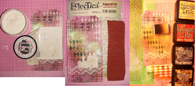
After the sprays were thoroughly dried, I used stencils with Distress inks. That's when I decided to stencil my London skyline (also recycled junk mail) with texture paste rather than inks. For good measure I then stamped into it before it dried completely.
I won't tell you how long to wait because it depends on so many factors, I haven't worked it out for myself! The trick is to create a test area of the same thickness on a piece of scrap paper to test when it's ready.

I painted the city in black and used Treasure gold in Amethyst (Paper Arty) to pick out the details, then decided to stamp a few things in black ink on the tag itself and a quote on a piece of card.
Quote and compass are Rubber Dance stamps, the cities borders are from Flonzcraft.

In this photo you can see how shiny the micas are, and reflect the light intensely compared to the Treasure gold.

The final touch is an arrow (Tando Creative) which, although made of fairly thick chipboard), can be embossed in a standard embossing folder. After embossing I pressed the arrow into my black dye inkpad and when dry I brushed Tresor gold in Amethyst and White Fire.


I hope you like my tag and that you will try out these, or one of the many stencil techniques available. Come and join the Country View Challenges with your stencilled makes.

Don't forget to leave a comment below before visiting my teammate Gabrielle for your next stop on our hop!

  I am entering the tag in the SSS Wednesday Challenge and Tando Creative challenge.

Tuesday, 26 April 2016

Sea, Sand & Sun

Before getting down to the business of crafting, a word on commenting. I try and visit the blogs of those entering the Dictionary challenge and those fellow bloggers leaving comments on mine, but if your blog settings restrict commenters to Google + members then I can't do it.
I already have more ID's that I can remember passwords for and I'm not a great user of social media and if your entry is on Facebook, Instagram etc... I won't be able to comment either.

So don't think I'm ignoring you...

************

After all the Spring makes, I am allowing myself a burst of summer feeling for the Craft Barn dictionary challenge. They gave the letter S and for a twist we have to include a shell. I thought of seashells and went in full beach mode! All I could think about is the famous song by Serge Gainsbourg with three S, and with the tune firmly ensconced in my brain, I had a vision.... Yes I knew I had the perfect stamps in my stash!

The post title was an obvious choice although I tweaked it a little...


In the foreground, I stamped a shell from the Paper Artsy set HP1111, inked with water based pens. The textured watercolour paper hides a lot of the detail from the stamp but I needed a base that stood up to lots of water.
The letter S is from a cheapo acrylic set.
All the other stamps are from the Rubber Dance Retro Beach set, inked with black Versafine.

I wanted to participate in the Paper Artsy latest challenge, and trying to keep white space was the most challenging part of this make, since I was intent on using my latest toy, namely the Paper Artsy Infusions, here the Violet Storms.
Now these little bottles of powders should come with a warning and a mandatory viewing of this video! Remember that like Brushos, Bistres, Color Bursts etc... those fine powders are VERY fine. They can, and do, go airborne and fly far with a gust of air. And that includes gusts of air created by a spray of water!

To keep it all under control I first masked with masking fluid (drawing gum, liquid frisket) all the stamping, then applied the water and the Infusion on top. Maybe a bit dark for the sea but I needed the contrast for the little boy.

Lots of you have been managing to include several other words with the same letter in your dictionary challenge pages and this is the first time I manage it... but today, with Serendipity on my side I had six! :))
Thanks for coming by,
Also entering the Stamploration challenge.

Sunday, 24 April 2016

Butterfly Beauty

Warmer weather calls for butterflies doesn't it ! SSS Monday want to see butterflies and they are such a universal theme, for adults and children, men and women, that it's one of the best to use to make cards for the "just in case" stock.


I created a small masterboard, with several layers of paints (Fresco by Paper Artsy) on a textured paper designed for oil pastels. I don't paint much in oil pastels and as this paper stands up well to wet media and the texture is nice it makes sense to re-purpose it!

I stencilled some texture paste, tinted with South Pacific Fresco paint, with a Crafter's Workshop stencil.
At this point I decided the background was too dark and added more paint in lighter shades.
I stamped a script stamp with white paint (Crafty Individuals CI-436) which yielded an imperfect distressed impression.

Finally the focal images were stamped, the butterflies from Crafty Individuals (CI-437)  which come as 2 steps images. I used black dye ink for the outlines and Fresco paints for the insides of the butterflies.

The sentiment is from the Rubber Dance Happy Birthday set, stamped with Versamark and embossed with detail white embossing powder.
Thanks for coming by,
I am entering the Penny Black and moreWOW Embossing powders,  We Love To Create and Tando Creative challenges

Thursday, 21 April 2016

Clean and green

Sometimes it's nice to make something CAS with lots of white space. It feels like a holiday, and allows going back to Mixed Media and messy art refreshed and renewed!

Paper Artsy challenged us to use some white space, which doesn't need to be white, just empty, and this is what I did:


I intended to try stamping a background with an acrylic bloc, ink and a spray of water.
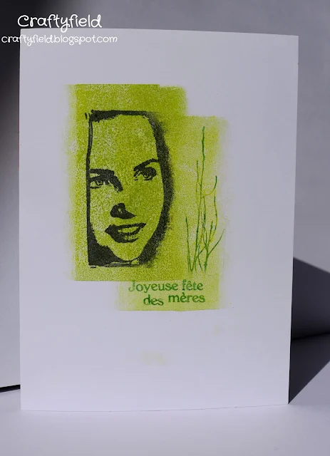
After several tries, I came up with a plan B that afforded me much better control: I used the reverse of a rectangular shaped polymer stamp and didn't need the spray of water, the most uncontrollable aspect of the technique!
The focal image and the branches are from the Paper Artsy set (HP1008) and I stamped partially the collage image, selecting only the face.

I don't know how I managed to resist adding anything else !

Thanks for coming by,
Also entering That's Crafty,  Casology, Stamplorations and SSS Wednesday challenges

Tuesday, 19 April 2016

Spring flowers

For my second Spring inspiration piece for this month theme at Country View Challenges I wanted to use one of the rubber stamp set from Paper Artsy's latest release.

For the base, I used an 8x8 piece of cardboard coated with gesso.

The grass colour has been built with South Pacific, Yellow submarine and Limelight Fresco acrylic paints fading the colour upwards with water. The sky is Lavender Fresco also faded into nothing using water.


The stamping was all done with black dye ink and I used all of the stamps in the EKC02 set, bar the sentiments. I created some rough masks by stamping and cutting the bigger blooms on a scrap piece of paper in order to place them in the foreground.

I added colour with white gel pen and yellow to orange colour pencils.

I really enjoyed building my wild flower field and the EKC02 makes it easy, as the small individuals flowers and smaller stalks are great to fill in between the bigger blooms.

If you're inspired, you can enter your own Spring make in the Country View Challenge
Thanks for coming by,
  Also entering the We Love To Create, SSS Monday and Vintage Journey challenges with my Mixed Media make.

Saturday, 16 April 2016

Dotty about flowers

Today I have another flower filled post for you. I am duty bound to enter the Indigo challenge this month to show off my stamps from the Colour me range, as I have been lucky to win a prize !

I did lots of experiments with the stamps and, although I won't show you everything today, I'll reveal that the flowers look really good with Brushos and micas powders as well as stamped with ink. Watercolour was a flop, but then, that's just likely to be my technique rather than the designs!  I haven't tried with embossing powders or... well, still lots to try yet!

Several stamps called for a multi-panel card, which is an excuse to use my Accordion die...


On the cover I used the Lily on glossy cardstock coloured with inks using foam applicators.


The papers all come from magazines freebies, the polka dot paper is actually pink dots on a yellow background although under British weather it looks grey!


From left to right, the first panel, is the Daisy stamped with dye inks and coloured with pencils.


The second panel is the Dahlia but it is actually the reverse side, coloured with alcohol markers.

The third panel shows off the detail of the Daisy stamp, with dye inks on glossy cardstock.

The stamps are slightly bigger than shown here as I had to fit the square panels of my accordion pages and cut them down.


 This is what my alcohol markers panel looks like on the front compared to the reverse:
 
I don't know about you but I thought that pink was too aggressive  and when I saw the watercolour effect of the back... I just had to use it!

The clue in the name (Colour me) tells me these flower images would be perfect made into small colouring books for crafty friends!

Thanks for coming by,
  Also entering the Stamping Sensations, SSS Wednesday and Polka Doodle challenges.

Sunday, 10 April 2016

Resistance

I'm always attracted to door stamps so when the D letter came up at the Craft Barn dictionary challenge this was a no-brainer...


Prompted by the Paper Artsy and the SSS Monday challenge, I used a resist technique with wax paper to create a wall around my door (I used a Crafty Individuals stamp as my Paper Artsy door was too big for my panel) . I embossed the wax paper with the Tim Holtz Brick wall folder then placed it over the card and, protecting the iron with scrap paper, ironed on the design.

Then it's just a matter of applying Distress inks with blending foam. Easy peasy...

For the "pink" twist I added my letter D in a salmon pink so it didn't jar too much with the earth colours of the picture.

Thanks for coming by,
  Also entering the Artistic Stamper challenge

Friday, 8 April 2016

April in Amsterdam

Stamplorations challenges us to use splatters for this month's Theme & Sketch. I love a good splatter so I couldn't resist.

I was going to print a sentiment on the card front but I chickened out as so many things can go wrong with printers. In the end I have managed to print the sentiment inside, after endless setting changes. My printer doesn't like non standard sizes!


Stamps used:
Paper Artsy HP1601 ,  ESN10
Docrafts: Ticket Stubs 6x6in, chevron from All Aboard Air Mail set 4x4in

I then used Brushos on the background and splattered both the water and the powder. I use a small brush to dip in the Brusho pot and tap on top of the water. The idea of piercing a hole in the lid fills me with dread as this stuff stains like mad!

To get all the buildings on the card I had to extend the stamping over the spine and I thought it looked rather nice.


What do you think?
I suppose I should show you the whole thing flat too!


Thanks for coming by,


Also entering That's Crafty and We Love To Create challenge

Tuesday, 5 April 2016

All things spring


Time for a new challenge at Vintage Stamping Challenges.

Our theme this month is All things spring and I am showing you a late Easter make using the Animal Landscapes border 01 by Flonzcraft. This set has 8 different borders of which I used 2 for this  simple scene I framed with an old aperture card.


This is what I did, step by step:

I marked lightly where my oval aperture would lay on a piece of white cardstock and stamped my rabbits and poultry in black ink. Note that the rabbits are stamped in a downward curve, a benefit of using polymer stamps as they can be curved.

I had to do this first so I would know where to shade my hills next, using masks and several shades of inks from yellow to green. You can use standard paper to create hill masks, indeed the feathery line of torn paper can be a bonus, but here I used an adhesive release paper. It's very smooth and acts like a silicone mat for the ink.
For the sky area I created a sun mask with a circle die and applied blue ink fading it towards the horizon. I then removed the mask and applied a little bit of yellow on the sun.

I lined up my cardstock behind the aperture and measured where I needed to cut my panel to fit.
Once glued in place I added the sentiment stamped in red ink.

I hope you will join us for this spring theme at Vintage Stamping Challenges, you could win a $20 voucher to spend at Flonzcraft, our lovely sponsor. Your make doesn't need to be Vintage but will need to showcase some stamping (rubber, clear, foam etc...) but NO digis.

Thanks for coming by,
  I am entering the Craft Barn and the SSS Wednesday challenges with my spring make.

Friday, 1 April 2016

Spring in my step

So my dear readers, if you have missed the clues, I'm joining the DT of Country View Challenges, hence the spring in my step, since I am over the moon to join this talented bunch. Well, that and the fact that our challenge theme this month is Spring.

For my first post I made this tag with Brushos (Leaf and Moss green, Yellow and Ultramarine) on a gessoed background:

I stamped both small and large motifs of the Eastern Grasses set (Chocolate Baroque) in varied green inks. I used first and second generation prints to get a sense of depth in my spring morning impression of a field.
The Spring sentiment is from another Chocolate Baroque set stamped in black Versafine.

Hope this inspire you, but there is more inspiration from my new team mates over at CountryView challenge if you need it! So come on and join us with your own artwork, full of the joy of Spring!