' ' ' 'Crafty Endeavours: September 2019

Friday 27 September 2019

CAS Christmas card design

This is my second inspiration post of the day both for my Crafts U Love, and I have another Christmas card with a design suitable for mass making .


Using the largest thin frames of the Julie Hickey Frame & Banner set I die-cut a piece of black and a piece of white cardstock. For this card I used the black frame and the "inside" of the die-cut white card. Like my previous design, the leftover can be used for another card in reverse colours, avoiding waste and saving time!

From the Boughs of Holly Wreath I die-cut and embossed the bow and die-cut the small wreath.

You can add the date and sentiment with either dies, stamps or stickers and, if you are addicted to Nuvo Drops as I now am, as many drops as you wish or have time for....  The holly berries holes in the die-cut wreath are crying out for Nuvo drops, I think!

Supplies:

Tonic Studios Essentials Die Set - Boughs of Holly Wreath
Studio Light A6 Paper Pad - No.119
Julie Hickey Designs Layers, Frames & Banners Die Set - Rectangle
Tonic Studios Nuvo Stone Drops - Gold Rush


Should you purchase any of the products I have used on this card, select  'Design Team'  in the 'where have you seen us' drop down so we know we have inspired you!

 
There you have it, a simple fairly quick and easy to mass produce design, with a very classic feel. If you missed my first post you will find it here.

Thanks for coming by,
I am entering the SSS Wednesday  challenges.

Season Greetings

I know it's still a bit early... but all the new craft stash is in the shops now and as I am less interested in Halloween, I wanted to carry on the x-mas production! In fact this is the first of 2 posts published today both on the Christmas theme!

I created this design to satisfy the following objectives:

- few supplies
- low wast
- easy
- quick to make in batches


I used a green and a red 6"x6" piece of cardstock, plus some white glitter card and the dies sets shown.

To cut the large wreath, I used the actual wreath die and the "inside" edge die.
Cutting the inside allows to keep to one layer and saves the green inside to make another card in the reverse colours. There is barely any waste, apart from the confetti from the wreath which goes straight to the bin without contributing to the ever growing scrap mountain.

The greeting is cut from the thick-ish glitter card but I still managed a clean cut with 2 passes in the die-cutting machine.

Using the same design but with other colour combinations you can quickly build up a stash of cards, all unique!

For example:

- Associate Gold and white with either Green, Red or Black for traditional Christmas
- Silver and white with Blue or Lavender for a contemporary look
- or Kraft, white and red for a rustic vibe

Of course you can add any number of finishing items, but as I had the rather loud Green and Red combo it was a case of less was definitely more… so I limited the embellishments to a bow which I die-cut  (same set as the wreath) from the glitter and red card.

Supplies:

A4 Glitter Card - White
Tonic Studios Essentials Die Set - Boughs of Holly Wreath
Tonic Studios Christmas Sentiment - Seasons Greeting


Should you purchase any of the products I have used on this card, select  'Design Team'  in the 'where have you seen us' drop down so we know we have inspired you!


Don't forget I have a second X-mas design coming up very soon.

Thanks for coming by,
I am entering the SSS Wednesday challenge.

Thursday 26 September 2019

Trees and Leaves

Please to finally post something again as I have been less present than usual on my blog. I was spurred on by the Allsorts challenge which had me at "trees" since I can't resist buying tree stamps....

Thank you so much for your lovely comments on my last post, many of you enjoyed the Alcohol Lift Ink technique. It's not that a similar effect couldn't be done another way, but it certainly was the easiest! And since you enjoyed that technical post... here's another one for you.

Today the technique is compliments from the Distress Oxides.


I wanted to create a background of Autumnal leaves to my tree image and wanted leaves and trees to use the same hues but the background had to be less bright.


I happened on this property of Distress Oxides when, by chance, I used it on photo paper and found that the dry "pigment" part of the ink, a whitish powder, was rubbing off the photo paper at the slightest touch.

And when the pigment is taken away there is no "Oxidation" effect anymore but the brightness of the Distress dyes comes to the fore.


Even at the stamping stage you can see that whilst the dye ink has been transferred to the photo paper a lot of the pigment stayed on the stamp.


Next I started buffing the stamped image with a paper towel and you can see the difference in brightness between the buffed area and the untouched image.


To assemble the card I used a Stitched rectangle die (from one of the MFT Blueprints), and the STAMPLorations Crazy Double Running Stitch Rectangle to cut the background and the mat. I then added the Hello (Tim Holtz/Sizzix Sentiment words) and a leaf brad.

And now for the full reveal...


Stamps used:
The leaves are from the Paper Artsy ELB33 set.
The trees are from the Crafty Individuals CI-429 set

Hope you like my card and have enjoyed reading about the D.O technique!

Thanks for coming by,
I am also entering the SSS MondaySSS Wednesday, and Unikostudio challenges.

Wednesday 11 September 2019

Heavy lifting

Alcohol Lift Ink Detail view

Yes it's time for my second inspiration make for the Country View Challenge, where the theme chosen by Rachel is Under the Sea.

This time I used alcohol inks to build up my background, and, together with the Alcohol lift ink and Yupo paper from Ranger, I had great fun creating water effects .

Lifted alcohol inks with stamps

First I tried to simulate the broken light seen in moving water by using crumpled plastic to lift the ink, then with a small eraser and embossing tools I lifted the bubbles above the fish.

I then stamped my fish (Paper Artsy Hot Pick 1111) with Memento Tuxedo black ink on a piece of paper prepared with an iridescent medium and fussy cut them before placing on my background.

At this point I decided to add "coral" by lifting the colour with the top of a tree stamp. You can see the before photo:

To achieve the effect,  I actually stamped the "coral" twice, once with the Alcohol lift ink and once with an Archival ink. The first pass with the Alcohol lift ink allowed me to lift most of the colour and the second pass added a bit of colour (one was stamped in pink the other in orange) which was blotted to leave just a hint of colour.
The technique relies on having a stamping platform but it is very effective, even on such fine detail as these tree branches (a Crafty Individual stamp from the CI- 450 set).

I will leave you with the shine shot and hope you will join us at Country View Challenges with your own Under the Sea creations!


Thanks for coming by,
I am entering the SSS Monday, SSS Wednesday, Lost Coast Designs (inspired by the Disney song Under the Sea...) and Craft Stamper TIMI  challenges.

Saturday 7 September 2019

A birthday like no other

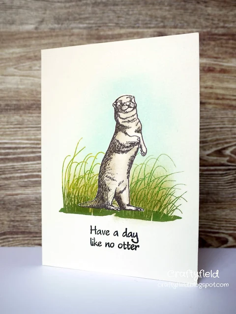
A few challenges pushed me to come out of my creative lethargy and I made this humoristic card (it will hopefully elicit a chuckle if not an out and out laugh!)

CAS card with stamped otter

I first stamped the otter in black and masked it. The grasses were stamped on top with green dye inks and I applied some Distress inks behind the animal. Both stamps are from a set issued with issue 57 of Creative Stamping (May 2018). as is the sentiment.

The otter was coloured with pencils.

Thanks for coming by,
I am entering the Addicted to stamps, SSS Wednesday, Casology, Penny Black and more challenges.

Sunday 1 September 2019

Just passing

Again, too quickly, back to school is upon us, the heat of the sun is fading and the beach is but a memory. Here at Country View Challenges, we have a final helping of sea albeit underwater... the theme chosen by Rachel for September (Under the Sea).

I hope my first inspiration make gives a good impression of an underwater scene!

Crafty Individuals CI-413

I made a card base from a 6" by 14" piece of cardstock and partially die cut the bottom with the outline die from the Studio Light Ocean View and made a mountain fold about 1" from the bottom, to get a folded card of 6"x6".
I die-cut white cardstock with the second die and coloured it with alcohol markers before gluing into place.

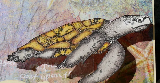
I decorated the front of the card with an underwater scene from Crafty Individuals paper  pad No 6 and stamped and coloured the turtle (CI-413) with pencils on a separate piece of card.
The turtle is attached to a piece of acetate I affixed to the back of the very first fold so that the animal leans back when the card is opened and not forward (yes I got that wrong the first time...)


Over to you... create a project following our Under the sea theme for a chance to win a £20 voucher in the Country View Crafts web shop!

Thanks for coming by,
I am entering the SSS Monday (my S is for Sea Scene), Addicted to stampsPenny Black and more and SSS Wednesday challenges.