Showing posts with label Scrapbooking. Show all posts

Monday, 28 June 2021

STAMPlorations turns 8!


Welcome to STAMPlorations 8th Birthday Celebrations! The DT has new products to show you and there are several ways to win prizes for joining us! If you don't come from the STAMplorations blog make sure you hop over to the post to read all the details.


STAMPlorations Birthday post

This is what I did with the Birthday Bundle #1, which consists of 4 products:
1. Blossom Sprays #4 4x6 stamp set
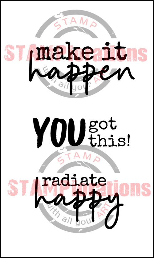
2. Radiate Happy 3x5 stamp set
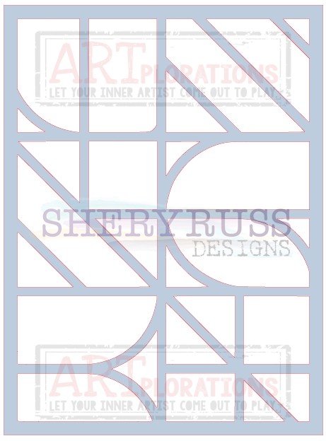
3. Design Blox Template #5 - 6x10, 10mil
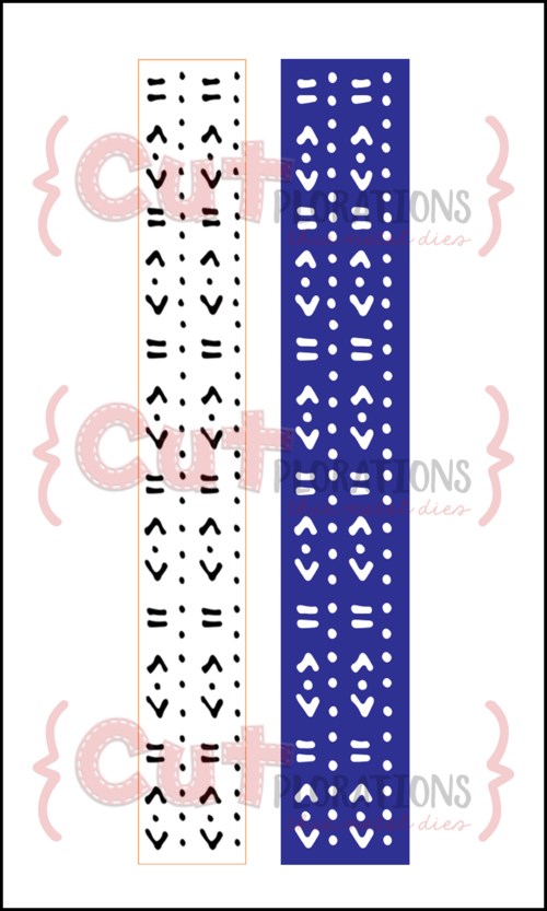
4. Art Border #1 CUTplorations thin metal die

      &nbsp
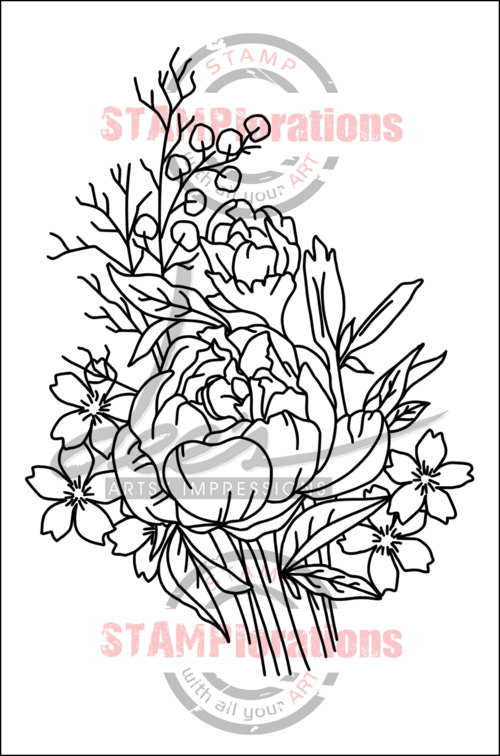
First up, a simple card with the Blossoms spray #4 stamp.

Blossoms Spray #4

As the stamp is big enough to fill most of an A2 (US size)/A6 card , I simply stamped the image with Versafine in Sepia and coloured it with pencils. The panel has been die-cut with the Stitched Snow Hills dies set.

Second a set of ATCs with the Radiate Happy stamp set

Radiate Happy stamps set
I used the stencil Blox #5 to create my backgrounds with different colours of Distress inks, masking with washi tape or paper when changing colours. I then die-cut the ATC's with the smallest of the dies in the Stitched Snow Hills dies set.
Finally I added sentiments from the Radiate Happy stamp set, embossing some of them with Wow! powders (Earthtone Olive, Primary Apple red, Skinny Chai Latte and Metalline Violet)

If you are doing project Life or any kind of scrapbooking, these are ideal as journaling cards as I have used here: 

Next I focused on the Art Border #1I like versatile products and this one delivers so I wanted to show you what you can do above and beyond cutting a border in a card, as nice as it is...


On this card, I used only one edge of the die to die-cut my card base all around with the line of dots. Turning the die the other way you would get the line with the hearts as I did in this next card at the bottom.

2 ways with the border die
I used the die again as a border on the right and stencilled a background with Distress Inks, brushes and the stencil Blox #5. My focal point is one of the new Vintage Blooms ATCs and my sentiment is one of the Radiate Happy set.

Finally, since the die only cuts the design, you can cut the die repeatedly to cover a whole card or more!!! The only limitations are the size of your paper and the size of your die-cutting machine:

Repeat die-cuting technique

Check out this my post here to find out more about this card.

The STAMP girls are showing inspiration for all the challenges on the STAMPlorations blog so pop by and don't forget to comment along the way for a chance to win.

***
Whenever you shop for STAMPlorations products you can get 20% off with my code: STAMPGIRLCRAFTY


***


Thanks for coming by,
My Blossoms Spray card is entering the Stamping Sensations challenge as I love colouring with pencils!
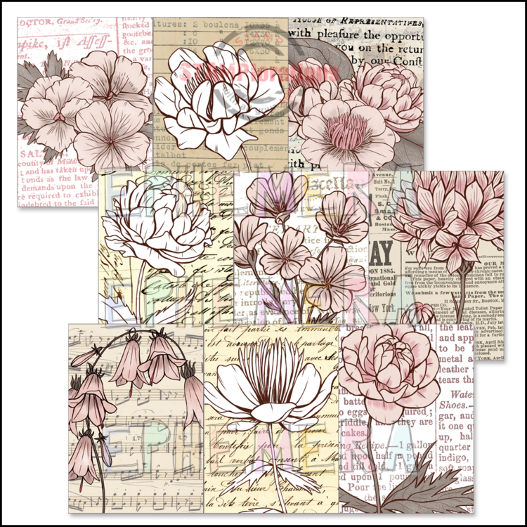
 

Wednesday, 11 March 2020

Her gaze

Today I'm showing my second inspiration make for the Country View Challenge on the theme "The eyes have it", chosen by my teammate Jane.


This is a project that took months to conceive but eventually came to fruition in a weekend... I had bought this Stamperia rice paper, not for a specific project, but because I fell in love with it and had to have it.  Of course the problem was, I didn't want to lose a single piece of it or obscure it in anyway, which  made it difficult to use it in a creative way.

So I went big... 12"x12" to be exact and the paper being A4 (21x29.7cms- approximately 8"1/4x11"1/5) I had some white space to add my own marks...
After months of creative drought I suddenly got excited to play with stamps, inks etc.. to create a a layout in the Vintage style that I favour.

 First, I divided the rice paper in 3 pieces, keeping the bottom left corner for another project and glued it in place with Mod podge. This paper is more sturdy than classic tissue paper and I was able to adhere the paper without wrinkles, although you may want to in order to have a more grungy look!

I gave a top coat of matt glaze to be sure the paper would be protected from any wet medium I might decide to add later...

I applied colour to the rest of the cardstock to blend it with the rice paper. No particular reason for my choice of medium apart from the fact that I wanted to avoid acrylic paints (it limits the choice of inks when stamping) and overly wet mediums.

Next I wanted to use my new Stamperia stencil, Wallpaper Fantasy and new stamp set - Enjoy to add interest to that (almost) virgin space.
I also used a texture stamp from Prima/Finnabair and although mine is from an older collection, you will find 15 different textures stamps from the Prima/Finnabair collection on the Country View Craft site, here.

With the stencil I used inks bottom left and gloss medium at the top of my layout, which I later foiled.

Next, with all the "messy" stuff finished I pulled out my Martha Stewart punches. They are probably seen as old school but unless you're the lucky owner of a Big Shot Pro, you cannot die-cut a 12"x12" page and punches are still the only way... Plus, I haven't used them very much, and they should earn their rather expensive real estate in my craft "room".

Once I had punched my corners and borders, I added more inks to blend the margins and distressed them too.
This particular corner isn't a PATP but a corner + unrelated border, which I have found a way to use together satisfactorily.

I then put together my focal point with a photo from an ephemera pack by Prima. The young girl and the woman had the same unyielding look in their eyes, which I thought perfect for our theme!

And now for the reveal....


I do hope you will like my page and join us in the Country View Challenge this month. As usual there is a £20 voucher to be won...

Do let me know in your comments if you have a lot of MS punches and how often you use them these days.
Thanks for coming by,
I am entering the SSS Monday (not a lot of green but a bit…), Vintage Journey and SSS Wednesday challenges.

Thursday, 17 August 2017

SSSS

Summer, Sun, Sea and Sand are the inspiration for this scrapbook page.

You will forgive the beach photo's odd colours as my printer's ink cartridge ran out on me... and I will replace the photo, as soon as I get around to have a 2 year back log printed, professionally this time!

Do come and check the step by step on the Craft Barn blog.


Supplies:

Watercolour card
Distress Oxide in Faded Jeans and Fossilized amber
Brayer
Kaisercraft stamp:
Impression Obession stamp: Canvas Cover-A-Card
Kaisercraft wooden embellishments
Gel medium
Sand and seashells: the real thing... collected on an beach!

Layouts are for me a labour of love, they do take me a long time because I tend to dither on each addition and I am never sure when to stop! However the size of the canvas (12x12) allows to play with lots of mediums, stamps and stencils and isn't that a crafter's dream...

Do let me know what (if!) you like on this layout in your comments,
Thanks for coming by today,
I am entering the Creative Artiste, SSS Monday,  Lost Coast Designs, The Artistic Stamper,  We Love To Create, Craft Stamper TIMI, and Fashionable Stamping challenges.

Friday, 5 May 2017

Make a wish

My method of scrapbooking is so slow I haven't done much recently and I am glad I finally managed one layout to add to my Vintage album.

If you want to read how I made it please go by the Craft Barn blog where I have written a step by step. I will share here some of the ideas behind my choices.


The photo is one of the rare photos we have of a great aunt. The story goes that she was a seamstress and this influenced my choice of paper and embellishments (buttons, lace, fabric, thread etc...) but was a frustrated actress. I believe this photo was taken on the occasion of a village play and is the only one where my great aunt shows her fun side.

I don't often do single pages layout as I have too many pictures but she deserved a full page to herself, her 5 minutes of fame at last...
Thanks for coming by,

I am entering the Craft Stamper TIMI challenge.

Friday, 10 June 2016

Beach Layout

I was the lucky winner of the March Vintage Journey challenge and I was invited to Guest Design.
The theme for this month's challenge, hosted by Astrid, is Embossing Pastes/Textures, a must have for Mixed Media work, and this is what I am showing today.

Hoping for warmer weather, I selected bright colours and let go the Vintage tones entirely, taking inspiration from beach colours for a holiday scrapbook page. The photo I have included is not actually the photo but a place holder I had great fun to design.


For the background I used sprays and Grunge paste with several stencils on my watercolour paper base.
As a feature I created a sandy beach on my "photo" and also in the top left corner with heavy gel medium, a touch of yellow acrylic paint and sand of course!

To make my fake photo I stamped the lady in Versafine on glossy paper (from the Take the plunge set by Rubber Dance) and coloured with Distress inks.

Finally I used some paste as a 3D glue to give my shells a more realistic shape.
To make them I first stamped them (all shells, starfish and seahorse are from the Rubber Dance Retro Beach set ), then fussy cut. I applied a bit of colour with Distress inks and shaped then with a ball tool, giving them a curve. The gel medium helps in supporting the curve as well as keeping the shells stuck!
I added a few sea creatures confetti (painted with gesso to dampen the garish colours), muslin, and micro beads.
Under this angle the sun catches the mica for maximum shine!


You can visit A Vintage Journey for more pictures.
Also entering the Our Creative Corner, Love to Create and That's Crafty challenges

Monday, 2 November 2015

Traditional Christmas

With Halloween behind us the next big event in the crafting calendar is looming large. So at Vintage Stamping Challenges we are concentrating on Christmas, and have chosen Traditional Christmas as our challenge theme this month.

For our Traditional Christmas theme I immediately thought of Graphic 45 and pulled out a few papers from an old collection (including the sentiment).
I used this sweet image from Flonzcraft, our sponsor, and stamped it in black (dye) ink on a very smooth card.

I added some Core'dination cardstock for matting and die-cut the mats to add interest without further bulk.

All layers have been inked all around the edges to give more of a Vintage look and my main image has had the Distress ink treatment (Antique Linen and Walnut inks).


Hop over to the Vintage Stamping Challenge blog to see what the rest of the DT has made this month. Join us in creating a Traditional Christmas make for the chance to win a $20 voucher for the Flonzcraft shop.  Remember your make doesn't need to be vintage but it does need to have some stamping, no digis allowed!

Thanks for coming by,

Monday, 14 September 2015

Layout

Before getting on with the post, I wanted to welcome my latest new followers, I am humbled by their interest and not a bit proud!

For the Rubber Dance September challenge we can use any of the previous 12 colour schemes. A no brainer for me, it had to be the June colours since I had made a layout for that month and needed to make the facing page at some point... 


The base is a 12x12 Chatsworth paper (Paper Artsy).
I used 3 of the Mixed Media Thinlit (Tim Holtz/Sizzix) to make the diamonds, hexagons and "pebbles" stencils which I used with paste mixed with blue paint. I then coloured those stencilled areas with acrylic paint to darken the corners.

I used the Diamond Background and Netting texture stamps both from Rubber Dance, with vanilla paint (diamonds) and dark chalk ink (netting).

To tie in with the other page I die-cut the title from the same paper as the previous page.
Hope you like my page,

Also entering the Craft Barn challenge.

Saturday, 22 August 2015

memories

I have been trying to muster enthusiasm to start on a few scrapbooking pages and had a look through my existing layouts (it usually works...) and found this one that just didn't work.

The background had been stamped, embossed with clear powder for a resist effect, sprayed and foiled...
Fortunately, because these are vintage photos, I didn't glue them to the page but used tissue tape to hold them in place so I could easily start again.

First I thought the background colour was too dark so I wanted to add white paint without losing all of the kraft background.
I have been wanting some 3D matt gel but I couldn't get any in the shop and bought the Ranger transparent texture paste, figuring it would be similar. I stencilled it through a Prima/Finnabair doily stencil in 3 places and when dry applied white paint over the paste and embossed areas wiping with a wet rag to reveal the design.

I added a doily die-cut (Prima) and a flower and leaves die-cut (Marianne dies) from metal and painted with acrylics.

Can't say it's perfect but it's definitely better than it was... I have a facing page to be transformed too so I better get to it before I lose interest!

Thanks for coming by,

I am entering  the WOW Embossing Powder and Paper Artsy challenges.

Tuesday, 29 April 2014

#3UP with Paper Artsy

If you don't know what #3UP is:

At the end of each 4 month blog cycle, Paper Artsy fills the spare week by featuring the work of their followers, generally highlighting their newest releases. The participants are randomly drawn and receive items from the new release to work with.

The wait is over, the secret is out... phew I can talk about it!!! Yes.. I was very lucky to be drawn for the #3UP challenge this semester, and today being the Chatsworth Paper Collection blog post, you will gather that this is what I have been working with.

As I had never used the Paper Artsy papers before, I wanted to give the Chatsworth a thorough road test in my project and I can tell you they did live up to the expectation, being as good quality as they appear (they are a hefty 240gsm) and resisting all my (wo)manhandling very well.

I am showing you here a snippet of my project but you must go to the Paper Artsy blog for the full reveal and catch what my fellow #3Uppers have done tonight.

See you there....

Friday, 28 February 2014

Inspired by Pam Thorburn (2)

Pam is back on the Paper Artsy blog with 3 scrapbook layouts. I chose this one as my inspiration, as soon as I saw the paint drips I had to have a go.
Of course sprays are quite unpredictable at the best of times but I decided to add micas sprays on top of my Fresco sprays and things got messy!

I substituted Pam's home made washi tapes by scraps of paper, as I had tons of them in a similar width to the washi, and a bit of Tim Holtz tissue paper. But I couldn't leave it alone and added scrim, texture paste through a stencil and a die-cut border. I stuck all these down before spraying, as I had to gesso them first as they all had different colours.

I completely lost control of the page and from then on I diverted quite a bit from Pam's design. I added torn and punched edges, vellum and a scrap of wax paper (used to die-cut, so this is actually the waste) and several die-cuts.
From an inadvertent puddle of mica spray on my table I stamped some circles with the said spray's cap.
Not a lot of stamping on this page but I have used some of the lettering of the Wisdom stamp from  ESN07.

Thanks for coming by,

Saturday, 1 February 2014

Inspired By Pam Thorburn

This week on the Paper Artsy blog we had some wonderful layouts by Pam, and I took inspiration from her first page.

I didn't have any piece of cardboard big enough for a 12x12 so I had to abandon that idea... So instead I printed the corrugations with paint ! Continuing the reverse process, since my background page was white, I stencilled solid hexagons in Aqua.

The colour choice was made for me by A Sprinkle of Imagination challenge:


 This challenged me quite a bit, not only because I had to create papers in the colours required, but also trying to find any embellishments in the colours! I used old designer papers, Fresco paints and a credit card (so easy and quick and limited clean-up!) to create my papers. I also used stamps from Hot Pick 1111 in the background.

The other challenge I had set myself was to use more papers and more layers in a layout so I followed the Scrap365 sketch, based on a layout by Els Brige:


As this is my first attempt at following a sketch I didn't dare deviate from the sketch too much!
With no further ado...


Challenging exercise but I am so glad I tried these "recipes" for my layout.

Thanks for coming by,


Sunday, 12 January 2014

Hung out to dry

I have a huge backlog of photos to scrap and it was high time I started to tackle it ! As usual this didn't turn out at all as expected but I am quite pleased with the feeling of fun that exudes from the layout.


I chose some Core'dination (Chocolate box) and just HAD to do some dry embossing, and since it is quite a dark colour I sprayed a mix of gesso and water through a stencil (Crafter's Workshop - Garden Gate) to tone it down in parts.
I created 3 letters with dies to complement the chipboard letters (My Mind's eye - Bloom & Grow) I already had, and used the remaining papers underneath the photos.
Washi tape, twine and tag stamp are from Docrafts, flowers and leaves stamps dies from Papertrey Ink.

I am entering the layout in the Lisa.B. Designs challenge and the Pan Pastels UK challenge. And yes,  there isn't a frosty finish in sight, but I did that for the previous challenge and didn't want to repeat myself!

Note: 
No scraps were created during the production of this layout!

Let me know what you think,


Monday, 14 October 2013

Halloween layout

Halloween is trending on all crafting blogs, so I feel duty bound to add my own Halloween post! As I am catching up with scrapbooking my photos, here's the layout I made:


All the stamps used are from Crafty Individuals, CI-319 for the image between the 2 photos, which I coloured with pencils and CI-209 for the embossed trees.

The idea, not entirely successful, was to emboss the trees with clear powder and use Versamark around the trees brushing mica powders (Imagination Crafts - Nature set) over the top, to create a spooky night scene. Trouble is I used Core'dination cardstock which is textured and I lost some of the stamp detail. The second problem I had was trying to clean the mica off the embossed trees...

I die-cut a few leaves, using the resulting stencil to ink some leaves (white pigment ink), and the letters for my title from some more Black magic Core'dination cardstock.

I am entering the following challenges:
Crafty IndividualsCountry View Crafts- Something Spooky, Imagination Crafts, My Mum's Craft shop, Pan Pastels UK, Ali-Craft

Thanks for coming by,

Sunday, 6 October 2013

No glittery substances spared


I know this was World Card Day but it's been so long since I have done a layout I needed to do something about it. Starting with the sorting, labelling and printing of almost 2 years' worth of photos! Prompted by the Impression Obsession challenge, I chose a photo taken in October last year, just as the leaves were turning, on one of those crisp and clear mornings where the sky colour takes on a deep blue shade.


I started with a blank page and used 2 stencils with sprays and Distress inks.
Using CAC Grunge (CC076) I distressed all 4 sides of the page and partially stamped CAC Branches (CC031) for some interest.
I created a mat for my photo with a MStewart PATP, without the corners as the size was incompatible, and a label with Flags Die Set (DIE015-F).

I punched out a leaf to make a stencil and applied texture paste through, when dry I used pigment ink and mica powder on top.

Some embossed vellum and a scrap of washi tape serve as embellishments to break up the fall colors.

Now for the glittery stuff... I wanted to have another go with foiling with the Sticky Stuff powder (Judikins) as the last time I tried it was an out and out disaster. For those unfamiliar with this, it is a powder, used like an embossing powder over a versamarked image, which turns sticky after heating with the embossing gun. When I got it I thought it was a better way than to use a glue pad,  less clean-up and no drying pad before it has even been used!

BUT.... it doesn't work as well. Below are detailed pictures of the areas I used as testing grounds. The stamp is a solid image, Rose Leaf Branch (F8199).

On the left, I stamped with the glue and applied the flakes before burnishing. As you can see the whole surface of the stamped has been covered. (and what a shine!)

On the right I used the powder and gilding flakes; when it failed I overstamped with Versamark and gold embossing powder. Only a small area was sticky enough to grab some flakes.


Powder 0, Glue 1. But would the powder work with glitter at least ? Below the result:

Definitely better than with the foil but even though the whole image was stamped, embossed and glittered at the same time and in the same manner, you can see the top leaves had a lot less stickyness to them. I surmise that the area has been overheated which means that the powder is VERY sensitive and a fraction of a second turns it into a useless mess.

My advice : don't use my powder! As well as being finicky the grain is quite large (larger than standard embossing powder) so the sticky surface is not as flat as it should be, particularly if you want to use detailed stamps.


I am also entering this layout in the Pan Pastel UK challenge.

If you do know a powder that does work (I know there are other brands out there) please let me know in your conmments!