Wednesday, 4 November 2015

Cardinal

Today I am guesting over the Rubber Dance blog and I am honoured and delighted!

I made a card following this month's challenge colours, using one of their newest stamp which I couldn't resist.... and I'm not a bird person! ** I still haven't fallen prey to TH Crazy Birds **

Anyway, for a full description of how I made this card you will need to visit the Rubber Dance blog here but without further ado, here it is:


Ingredients;
All stamps: Rubber Dance
Dies:           Memory Box Corner and tree branch, Joycrafts leaves
Embossing powder: WOW Pearl Blue
Watercolour: Winsor & Newton
Watercolour pencils: Faber Castell


Thanks for coming by,

Also entering the WOW Embossing powders and Penny Black and more challenges.

Tuesday, 3 November 2015

3 Times the paint

I had a raging desire to get painty, inky and all around messy in the craftroom this weekend. Time for some mixed media, methinks...

Paper Artsy want Triptychs this fortnight, perfect...


I started my project with only half a plan as is typical for me... it does leave me with problems later but it's more fun this way. Leandra had an inspiring video which I based my project on and I started applying Fresco paints in the same way that she did.
Then I added Distress inks where I wanted more transparent colour. To complete the background I stamped a script (Mini30) with several colours of India ink pens (Faber Castell Big Brush pens), as well as 2 motifs from the ESN10 plate.

Also from Paper Artsy is the focal image which I stamped in dye ink and lost some of its definition in the process. Initially it bothered me, but now, I think the distressed look is quite nice in the context.
Then, it occurred to me that I had quite a large space under my "town" and decided to fill it with a reflection. Had I planned to do this at the start I probably would have remembered to mirror stamp the image, thereby obtaining a near perfect image... but no.., it did not occur and I painted the reflection in with a brush...
On impulse I added 2 journalling phrases from a Rubber Dance plate.


With my triptych finished, I turned my attention to the back, as yet untouched and unplanned... I used a fairly large scrap of Paper Artsy double sided Chatsworth paper, tearing each side apart to get enough to cover the back of my triptych. I transferred the image using gel medium before realising I had to cover it with opaque paint to obliterate the writing underneath. Yep I have been recycling cardboard! Desperation set in and I threw on some acrylics inks and sprayed, resulting in this look:


Finally I die-cut several hinges, following an idea from Alison Bomber seen here with the Tim Holtz/Sizzix Hardware Findings Bigz die.

And in the end, I quite like my triptych warts and all!

I hope you'll like it too but do tell me if I'm deluding myself!


I am also entering this mixed media piece in the That Craft Place, SSS Wednesday Challenge and We Love To Create challenges.

Monday, 2 November 2015

Traditional Christmas

With Halloween behind us the next big event in the crafting calendar is looming large. So at Vintage Stamping Challenges we are concentrating on Christmas, and have chosen Traditional Christmas as our challenge theme this month.

For our Traditional Christmas theme I immediately thought of Graphic 45 and pulled out a few papers from an old collection (including the sentiment).
I used this sweet image from Flonzcraft, our sponsor, and stamped it in black (dye) ink on a very smooth card.

I added some Core'dination cardstock for matting and die-cut the mats to add interest without further bulk.

All layers have been inked all around the edges to give more of a Vintage look and my main image has had the Distress ink treatment (Antique Linen and Walnut inks).


Hop over to the Vintage Stamping Challenge blog to see what the rest of the DT has made this month. Join us in creating a Traditional Christmas make for the chance to win a $20 voucher for the Flonzcraft shop.  Remember your make doesn't need to be vintage but it does need to have some stamping, no digis allowed!

Thanks for coming by,

Saturday, 24 October 2015

Good Luck

If the Craft Barn is not your local craft shop, you may not be aware that the physical shop has closed last weekend to become an online retailer exclusively. So, the challenge this week is a bit special and, whilst last week the Craft Barn DT was using Impression Obsession Cover A Card background stamps, our challenge is to make a Good luck card.
Still, I was intent on using my own Impression Obsession stamps which are one my favourite brands...

In a departure from my usual makes this is an hybrid project where I combined the rubber stamped image (I stamped the IO Ornate stamp with Versamark and used soft pastels on top in several shades of blue and turquoise) and digital elements in the form of a poster and a sentiment.

So there it is, wishing the Craft Barn all the best for the future whilst trying to keep calm about not getting my usual crafting fix at the shop, since I can still Keep on shopping...


The shining

For those who, relying on this post's title, were expecting some gory Halloween scene... sorry to disappoint this is totally not scary, just shiny in a glittery way...
Yes, Lavinia Stamps want to see some gems and glitter this month and I used my Dandelions again for this simple card.


For the background I used an alcohol ink background I had made whilst cleaning my craft mat and added some dandelions stamped with dye inks.

Then I stamped the foreground Dandelions in black Versafine and overstamped them with glue. Finally I sprinkled the glitter, a very fine blue-ish glitter.

The 3 hearts gems finish the card. Another look at the shine:


Thanks for coming by,

Also entering the Polka Doodle challenge.

Saturday, 17 October 2015

Drawing faces

It's face off at Paper Artsy this fortnight and I felt duty bound to join in since I ducked out of the fabric challenge last time...
I don't do faces normally so this was a real challenge for me, and I was planning a whimsical feel to hide any anatomical and perspective errors. Along the line I lost the whimsy, apart from the big eyes, and there are a few odd looking bits but since I didn't model my face on a real person I won't get any complaints there...


I used watercolour pencils and crayons for the both the drawing and the colouring and I softened everything with a water brush.
I couldn't think of anything clever to stamp on/around my face and stopped tinkering as it wasn't getting any better!

Faces aren't my favourite but I'm pleased I managed to finish my drawing,
Have a crafty weekend!

Also entering the Simon Says Stamp challenge.

Thursday, 15 October 2015

Light-house

This week's theme at the Craft Barn is Light and I thought of this beautiful lighthouse stamp (Cape Lookout Lighthouse by Impression Obsession). I worked on a placemat which is part of a series,  so I followed the same colour scheme but this time I used a Clean and simple design to let the Light shine...


After stamping the lighthouse  I saw Turner-esque sky and atmosphere. OK Turner wouldn't have painted his sky green but I was seeing past the actual hue... Well I couldn't bring myself to detract from that impression, so I tentatively stamped in white pigment ink the water splash, then the quote (both from KTZ135 set by Katzelkraft) leaving an awful lot of white space (again green but you know what I mean...).
I do hope you get the strong sense of light that I do when looking at this picture.

Thanks for coming by,

Also entering the We Love To Create challenge.

Sunday, 11 October 2015

Calendar Challenge October

The colour for this month Craft Barn challenge is orange and the word Pumpkin or fruit.
Orange, the dominant colour of Autumn, amongst the lovely shades of green yellow and Brown of the Fallen leaves.... and part of the colour scheme of the Rubber Dance challenge this month!

But I didn't go for the pumpkin(s) as I have no pumpkin stamps... I do, however, have a  Pear-fect fruit stamp from Rubber Dance which cried out to be coloured in pencils.


Behind the pears I stencilled a Cornucopia motif from an old book of stencils [1]. I chose it as the Cornucopia has been associated to Thanksgiving in the US and harvest time in general, so appropriate for an autumn page.

Thanks for coming by,

[1] This is the book that Chrissie from Jumbled Craft got as a bargain. She has a pic of said book in this post if you're curious...

Also entering the Tando Creative and We Love To Create challenges.

Tim Holtz style

What if Tim Holtz did Art journaling... this is the theme of the Vintage Journey challenge this month and I was piqued. Indeed what would HE do, I mused.

I got around the journaling aspect by borrowing someone else's words and type (from the Rubber Dance Affirmations plate) as I hate my own handwriting.

For my background I used Gelatos on a shiny textured paper which allowed the pigment to glide well. Why Gelatos and not Distress inks you ask? Well for one the inks I have are of the grungy range not the cleaner, brighter hues of more recent releases and secondly they would not dry on this paper! But the effect is similar I think...


I used a Tim Holtz stamp (CMS 021 - Enjoy the Journey), chosen for its masculine and vintage feel. I added some old clock faces from a freebie set (Papermania) and a Flonzcraft set (True Gentleman).

I thought about adding some stamping to the background but with the paper texture small motifs (think script stamps) weren't working well.
I think Tim would have added lots more and gone further but for me it's enough!

Tell me what YOU think in your comments,
Have a crafting Sunday!

Also entering That's Crafty, The Artistic Stamper and Craft Barn challenges.

Wednesday, 7 October 2015

One for a tweenie

No grunge, Distressed or Vintage today, pink and girly it is... for a young girl, not quite a teenager but too old for dolls and teddy bears!

I fancied doing a bit of colouring and I have very few stamps for this, I chose this image from Flonzcrafts and watercolour pencils which means my make is totally following our theme at Vintage Stamping Challenge.


The base card, one of my favourite shape, is a lovely smooth silk card that take the ink very well, so well I needn't have pressed so much on my stamp!

With such a contrast between the deep black of the stamped image and the white of the card I was tempted to leave it CAS without adding anything. But this isn't for me, so I needed a few more things to make it look "finished".
On came the die-cuts and I know it doesn't look like many but I used 6 different dies!

At the centre of flowers I added a tiny bit of Flowersoft, it's great to use some of the neglected stash!

Thanks for coming by,

Monday, 5 October 2015

Brrr!!!

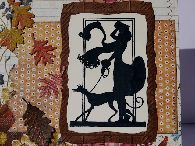
It's October and Autumn is truly upon us, flamed coloured leaves are falling and it's getting cold and windy over here. I feel like my Flonzcraft Girl with dog (also available as part of this full sheet) who is bearing the brunt of those nasty gusts that blow the remaining leaves off the trees, although not so elegantly!


This month's theme at Vintage Stamping Challenges is die-cuts and I pulled several of my dies to create a background for my Art Nouveau silhouette:
  • 2 sizes of  Spellbinders labels (image and mat)
  • leaves (Joy crafts)
  • Jumbo rick rack (Papertrey ink)
  • Notebook Edge (My Favorite Thing)
I used some designer papers from Prima and HOTP adding some machine stitching with a multi-coloured metallic thread (the TIMI challenge at Craft Stamper gave me the idea).
The leaves have been coloured with Gelatos or copper powder (plus vinegar for a verdigris effect!) to highlight the raised areas.

The brown mat for the image has been embossed with a Tartan X-cut folder for some added texture.


Hop over to the Vintage Stamping Challenge blog to see what the rest of the DT has made this month. Join us and Use your die-cuts for the chance to win a $20 voucher for the Flonzcraft shop.  Remember your make doesn't need to be vintage but is does need to have some stamping, no digis allowed!

Thanks for coming by,

Tuesday, 29 September 2015

Painty

The Lisa.B.Designs challenge this month is all about acrylic paints backgrounds and coincidentally
the Tando Creative blog also had a Painty week this month.

With that in mind I created a masterboard with a piece of white A3 paper. Stupidly I didn't take a picture of the completed background before I started cutting into it so this is what is left!

I followed Lisa's tutorial quite closely, and used hexagons and circles stencils (die-cut with Papertrey inks dies) and for stamps Stampendous Grunge and Paper Artsy ESN10 (in lieu of Lisa's bottle's lid)

Then I started on the finished product, which I am currently thinking will be made of 3 tubular boxes and will be used for storage in the bathroom. I pulled out the closest themed stamps I had, the Crafty Individuals perfume bottles from the CI-341 set and stamped them in black. On a whim, I threw in the twenties lady (from another set) and coloured the images with Big Brush pens (Faber Castell) and a water brush.

To make it durable (and washable) I then applied several coats of varnish (DecoArt Soft-Touch) and sprayed the plastic lid with Silver paint (not sure this will be durable as I was supposed to prime it first with a specialist product).

Thanks for coming by,

Also entering the That's Crafty challenge with my girly make !