Friday, 11 May 2012

New Baby Card

WARNING ! Cute ahead....

I have been preparing for a new arrival and made a card and a gift. I will show my crafted gift in a later post but for now here's the card:


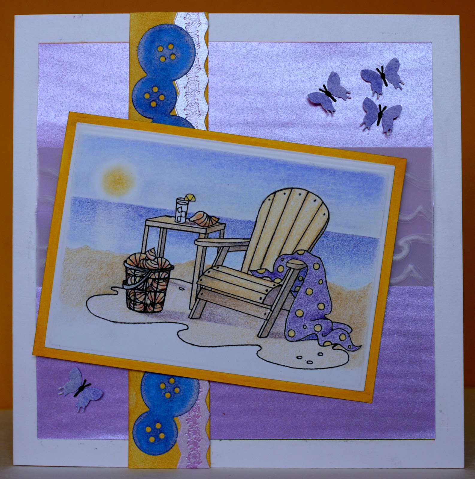
I have used papers from my supplies of  Docrafts "Me to You" collection and teamed it with a stamp from the Forever Friends collection. For the greeting I used my printer and a fun Dafont font. For colouring I started with alcohol markers and finished with coloured pencils. And because the front of the card was starting to get heavy I decided to stick patterned papers and die-cuts on the inside too (since I have happened on this idea I find I use that formula quite a bit !) :


You will note that I have blues and pinks and yellows as a scheme so that the card will fit in with either Boy or Girl !

See you soon for pictures of the gift,

Thursday, 3 May 2012

And now for something different

It started with one embossed, painted and distressed square some 2 years ago. I got hooked... so I did another, and another... soon, I had more squares than I could use for cards, and I thought I should keep my creations for future reference of the techniques and designs I could get from my supplies.
The idea was born ! I had an unused board from the back of an old frame that could accomodate 30 squares (9cm each) and every now and then I would add a square to my collection until I got 30. As a whole, it isn't brilliant because apart from laying my "black" squares all on the outside there is a lack of unity in colors but if I need to do something similar next time I will know!

I have used stamps, mainly freebies from Craft Stamper magazine as they are not too detailed, embossing folders, brass stencils, texture plates (Ten Seconds Studio, Fiskars, letterpress), dies and found objects (e.g. paperclip). For black distressing, where starting from uncoloured aluminium, I have used black acrylic paint, black inkpad or black alcohol ink. The colours are either markers or Tim Holtz alcohol inks. And here is a close-up :

I hope you too have go at metal embossing !

Friday, 20 April 2012

Flower Power

This is the theme for this week's Impression Obsession challenge. I have decided to put the power into the flower by choosing  "power" colors for my flower, i.e the metallics. My initial idea was to use metallic flakes but technically it was a no go. Wet glue is incredibly difficult to work with for flakes and I couldn't use a glue pad or stamp & bond embossing powder since I wanted the inside of the flower gilded not the outline. For my plan B I decided to use gel pens, reserving the flakes for the die-cut.


I have used a pale gold pen for the "top" flowers, a deeper gold for the flowers which would be in the shade and silver for the leaves. The photo doesn't show how shiny the silver pen really is, one of the best gel pens I have used (Uniball Signo). The image was stamped on an iridescent pinkish card and I used some gold patterned paper to layer. The die-cut (Die-namics) and some twine finish off the design.

Thanks for coming by,

Thursday, 19 April 2012

Time for Summer Challenge

Another summer card for another challenge... this time for the Crafty Individuals challenge.
For the main image, I have used CI - 294 with brown ink and applied distress inks on top.


I have machine stitched quite a bit and  managed to keep the stitching almost straight for once ! The pink background layer is a piece of material (used to be white but I painted it pink), overstamped with small stamps or parts of stamps (mainly from CI).
The clock is a replica of a Tim Holtz Ideology clock (home made), I used the flowers' stalks to create a heart and a squiggle.

And then... I realised how heavy the front was going to be and I decided to make this into an easel card, and decorate the inside (die-cuts by Spellbinders and Memory Box) to balance the weight.


Hope you will like,

Friday, 6 April 2012

Summer Fun In The Water and Sun

After Spring... Summer ! I love the season, the water, the sun... So while I am waiting for the sunny days I created this card for the Impression Obsession challenge .


For the main image I stamped IO's Beach Chair (F2337) and colored it with pencils.
Just peeping under the image is a piece of vellum, embossed with a wave design (Fiskars plate), a Button border die-cut (Memory Box). A few punched out butterflies complete the card.

Thanks for coming by,

Monday, 19 March 2012

Spring is in the Air

I played around with my latest Cover a Card purchase this week end and decided to use one of the prints to enter the Impression Obsession Spring is in the air Challenge.

The stamp is CC031 - Branches and has been stamped in sepia ink on top of glossy card colored using a foam technique (drop some re-inker on foamy water and place the cardstock on top),  although it is difficult to see most of the bubbles in the picture.


For the Spring part, I sponged some green acrylic paint in a "spotlight", created by a Memory box die-cut, to represent the first shoots.
Hope you'll like it !

Tuesday, 6 March 2012

True Blue

Impression Obsession has a "True Blue" Challenge and this is the card I have entered. I love their Cover a Card background stamps and blue is my favorite color...


I have used Cover a card Geologic (CC011) and Hydrangea (L2154) stamps from Impression Obsession, which I colored with pencils.

Thanks for coming by,

Monday, 20 February 2012

Spring Challenge

Just as the snow fell, February Crafty Individuals' challenge takes us to spring !

For this card I have resisted any type of distressing, collaging, grunging (if there is such a word), to let the beauty of the stamp shine. The quality and the detail of this set (CI- 259) is such, that I felt inspired to create a mini painting, one that could not be achieved the traditional way ! It was also a bit of a technical stamping challenge as it involved inking the stamps with 2 inkpads and a marker (for the trunks) and some nifty positioning.


In the foreground I used some stamp & bond with white flock and Flower soft to give texture. For the white flock to appear white (or nearly white) I had to first resist stamp with versamark  before brayering my background and then overstamp with white pigment ink on the flower heads. To finish the card I framed it with some die-cuts and a title.
All the foreground elements are from plate CI- 207 including the small butterfly and dragon fly.
See a close-up of the trees :


I am really pleased I tried these techniques even though this took me forever !

Thanks for coming by,

Thursday, 2 February 2012

Mass production

Some of you will look on this with incredulity - is she mad ? Christmas in February ? - and some will be impressed at my organisation... But when the next season comes around I want to get enough time to create a few special cards rather than rushing to produce lots of cards or buy some - perish the thought- like last Christmas.


In all there are 12 cards and envelopes with a design for boys and one for girls.

I have designed the set to minimise effort and cost. I used the "free" papers from magazines to make envelopes using the largest die from the Grand square dies from Spellbinders. I added a small die cut to make a label from white paper for the address. With the smallest die from the same set I cut the card bases using some bristol board.
The design on the card has been stamped with "free" acrylic stamps from another magazine and coloured with Coloursoft pencils and solvent. - I originally wanted to use markers but the colour showed through the bristol board.-

That's it ! No bling, no glitter, no fussing, and a minimum of punching (I rounded the top triangle of the envelope).

Thanks for coming by,

Thursday, 5 January 2012

Wedding Card

Happy New Year all ! It will take a bit of time to get back into the swing of things and I haven't had a lot of time to craft. But...here's one I made earlier...this is a wedding card and I had to wait until after the wedding to share it on my blog ! The style is meant to be opulent but clean.


I used a letter press technique to deboss and colour the background in one pass of my die cutting machine. I just love the technique! I stamped and embossed a piece of vellum in gold and placed it over black card edged with a Martha Stewart border punch. On the frame (detail below) I have used gilding flakes in a variegated colour. The sentiment has been printed, as I did not have stamps small enough to fit in the frame, and embossed with clear powder. And yes, it is possible to emboss from your printer ink as long as your paper/card is not too absorbent and it is done quickly. Brads are helping to attach the vellum (I have applied adhesive in areas where it would not show) and a ribbon rounds off the card.


Thanks for coming by,

Saturday, 17 December 2011

Crafty Individuals All Wrapped Up challenge

I wasn't sure I would have time to do the challenge justice and, I must say, given time I would have made some wrapping paper, but this is so time consuming I chose to customise a kraft paper bag instead.


I used CI - 209 for the main image stamped in Versafine sepia ink on top of a glimmer mist background. I embossed a few snowflakes in white, added a wrinkled flower (several layers of tulle heated maintained in place by a brad), buttons die-cut borders threaded with faux twine.
For practical reasons, to prevent anyone peeking inside the bag..., I wrapped a ribbon round with a die-cut buckle.

I hope you will like this project and as it will be my last post for the year, let me wish you a Merry Christmas and a Happy New Year.

Thursday, 8 December 2011

Easel Christmas Card

I know, I know  the stamp I used is "cute" and it is not my favorite style... but sometimes one has to create with the recipient in mind !


For the background I have used some Black Magic Core'dination cardstock in green and "free" papers from a magazine. I added gems and glitter to the front panel paper and placed a strip of patterned paper with added die-cut borders on top. For the main image I stamped the bear (another freebie) in a light colour of distress ink and coloured it with pencils. Then - this is where it gets exciting - I wanted to clear emboss the whole panel with clear powder, with the edges in glitter clear. However, when I grabbed my canister (I keep a few film canisters for my home made embossing powder mixes) I didn't realise this was the white and glitter powder ! But what a happy accident, as a few of the white grains of embossing reach a flow of clear powder they just look like snowflakes. You can see the effect in the detail photo :


I expect this is the last Christmas card I am going to make this year and I hope I will get some time to catch up with my other crafting projects...