Thursday, 18 October 2012

Calendar Challenge : White/Yellow/Green

This week, the Craft Barn challenge is to use White, Yellow and Green for the 3rd page of our Calendar.


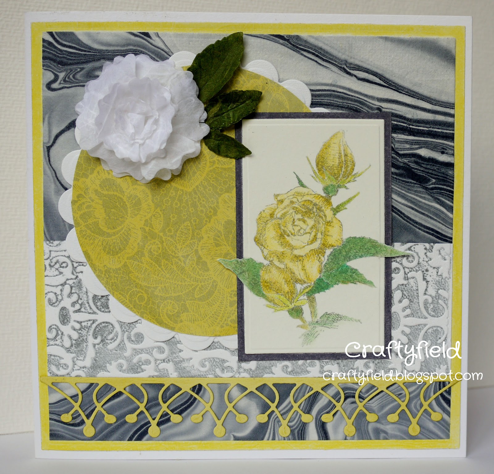
I decided to go all in and use yellow for my rose image for harmony, rather than use a contrasting red or pink colour, adding just a touch of orange with ribbon.


The page has been die-cut with a Grand Spellbinders die, then embossed with the die still in place, adding a second smaller die where my image will sit, over an Impressabilitie.
I used distress inks and Cut & Dry foam to colour the embossing .


The central image is by Impression Obsession and I have used markers in yellow and green to stamp, colouring with pencils over the top.
It's a lot of yellow and green... more than I would use normally, but then it IS a challenge !

Thanks for coming and look !

Saturday, 13 October 2012

Calendar Challenge : Bright Colours

For our second calendar page the Craft Barn team is tasking us with using bright colours, for instance the Dylusions inks. I haven't got any of those (yet), but I do have a mixed assortment of sprays :  with and without micas, branded and home made etc...

I immediately knew which stamps I wanted to use and sprayed my page in bands of colours to suit the scene :


I used an Archival black inkpad and some water based markers for the grass and plants, then I removed colour with thin bleach in some areas (I tried lifting the colour with water only but being dyes the colours didn't shift at all).
Still not sure if I should have bleached more areas of the house and/or added colour, for instance made the roof red...

Let me know what you think,

Friday, 12 October 2012

Yellow and Gray

Oops!!! This post has been published on 22/08/2012 but somehow is popping back ! Needless to say the challenge is closed...
The Impression Obsession challenge this week is Yellow and Grey. I don't use grey very often but...
The main image is Rose (E1332) by Gary Robertson, which I colored in pencil on white card. I then cut around the leaves with scissors before die-cutting with a rectangle die.


For the background, I used an old piece of handmade marbled paper, a piece of white card letterpressed in grey ink with a cuttlebug folder, a scalloped die-cut and a yellow circle stamped in grey ink with  Cover a card Rose Lace (CC087).
In the bright light of day, I decided that the yellow card I used was too yellow and knocked it back with a pigment inkpad, including the already stamped circle, which is why the grey is not as dark as I would have wished !

For embellishments I added a die-cut border (Pristine by Memory Box), flower (several layers die-cut with 3 sizes of  Spellinders' Peonies Nestabilitie) and leaves (Memory Box).

Hope you'll like this,

Saturday, 6 October 2012

Calendar Challenge: Vellum

It's time for the Calendar challenge at the Craft Barn and, for this first week we have to use vellum.
At this stage I am not sure I will be able to complete the 12 weeks challenge, but I could not pass the opportunity to use vellum, as I have rather a lot languishing in my stash... So here goes :

I have used a Spellbinders Grand Label die for my shape and a Cuttlebug folder (Iron gate) to emboss my image onto a printed vellum. I coloured it from the back with alcohol inks and added some home-made washi tape at the top and bottom to maintain the vellum in place. Fairly simple !

Thanks for coming by,

Friday, 21 September 2012

Natured Inspired


The Impression Obsession Challenge this week is "Nature Inspired". For my entry I have selected  again the Cover a Card  CC031, since this is the most appropriate for the theme. Though this time, I have chosen "natural" colors !

My regular readers will have a sense of déjà vu, as the design is fairly similar to my previous IO challenge entry, but I still could not bring myself to hide the image behind other elements, so I kept those to a minimum: a wooden button and twine, some kraft paper and a sliver of blue card stock.

Initially I was going to use sprays over my stamped image and selected a lightweight watercolor paper able to withstand the moisture. However, after several tries, I wasn't getting the effect I wanted and changed tactic. Using the reverse of the paper (I hate waste), I stamped again using my newest ink, i.e my wettest, Versamagic in Eggplant in order to get the best impression despite the texture of the paper. I then applied distress inks in Tumbled glass, Spun sugar and Forest Moss with Cut N Dry foam. I distressed the edges with scissors and matted on a piece of maroon card stock.

Hope you'll like this card,

Monday, 10 September 2012

Art Journal Challenge

Well... not as such as I don't do journals but similar ! I am taking advantage of the Craft Barn latest challenge to beautify an on going project of mine. I am building up pages for a book to contain all my samples, test pieces etc.. Each page has pocket(s) at the back, leaving me free to decorate the front as I wish, although I am careful not to build thick layers.
There wasn't a master plan here but I intended to use some masks and sprays and selected stamps according to how much use I had from them, i.e cracked open those that hadn't been used for a while !


I have used stamps from Crafty Individuals and Katzelkraft, using my darkest ink (Ranger's Archival) for the main image. The border on the left is texture paste through a DIY stencil.
I thoroughly enjoyed the exercise as it didn't matter if the result was awful, since the book is for only for me.
Thanks for coming by,

Sunday, 9 September 2012

Favorite Quote

I am joining the Impression  Obsession's challenge, "Favorite Quote/ Saying". Now, I don't tend to use quotes on my cards, but I thought this one would always allow me to use pink inappropriately

The background stamp is CAC Branches (CC031) and the quote is Rose Colored Glasses (D8256)
I have been playing with dye inks and glossy card with the resist technique, and tried several inks (metallic pigment inks work well as a resist). Here I have used versamark.


I think I overinked the brayer here as the colors are... let's say vivid...   but decided to go with it anyway as I still love the image. I have kept layers to a minimum because I didn't want to hide the Branches image and used a Martha Stewart Corner punch on one side and rounded the corners on the other side of a rectangle piece of white card.
One more thing... the "sun" in the image is actually the flash reflecting from the glossy card, and I thought it looked great... wish I could replicate the effect with inks but...

Thanks for coming by,

Last Days of Summer

I have been meaning to make a cover for my new phone, so when the Crafty Individuals challenge came along, I decided to see if I could fit my project with the theme.
And the stamps I chose tell the story of the last days of holidays for young girls (CI-284) about to return to their school with its ancient door (CI-249) !

I only used scraps to make the cover (my attempt at up-cycling), the material on the outside cover started as white and I used silk paint to color it and craft inks to stamps with (Versacraft), in a bid to make it washable. I then backed the stamped material with a scrap of an old ironing board cover, then machine stitched on the reverse. Not being the best at sewing, the stitching is not entirely straight but the cover offers a snug fit to my phone and does a good enough job of protecting it.


I have refrained from sewing on or attaching anything to the cover because I realised that in my handbag these things would just get snagged !

Not all the inks did well on that surface and overall the impression looks a bit faded (I got the best impressions  with the wetter pads).


All stamps, except for the flourish stamped in pink, are Crafty Individuals.

Thanks for coming by,

Blog Candy at Crafty Individuals


Pop along to the Crafty Individuals blog to see their new stamps, masks and must have and feast your eyes on this blog candy:


Good luck !


Tuesday, 28 August 2012

Blog Candy at the Craftbarn


The Craftbarn have over 1000 followers and are celebrating with a fantastic blog candy worth £150.


To enter see the details on the Craftbarn blog.

Good luck,

Thursday, 23 August 2012

Colouring techniques challenge

The Craft Barn has set us a challenge to use one of the colouring techniques shown by their DT. I plumped for the technique shown by Neil as I had in mind some detailed stamps that could use several colours, which can only be achieved by using markers !
The project below is one page of a book I am creating to organise my bits of stamped, embossed, punched pieces of card etc.. and the reverse has a pocket to insert these samples.

I have kept the design flat as there will be bulk at the back in the pocket, and simple as I have lots more pages to make for the book ! Stamps used are from Crafty Individuals.
Thanks for coming by,

Sunday, 5 August 2012

It's A Man's World

So true... Well, very much ahead of time I have made a Father's Day card for the Impression Obession Challenge. I had already used the same stamp for this year and as soon as I finished it I had a better idea and this is it.


The main image is a Gary Roberston's design stamp, Potting Shed ( H1802), which I colored with Pencils. This is such a detailed image that, as I was coloring, I was discovering bits that I hadn't spotted before. The coloring is a a bit too pale but I left it as is, since the idea was to show a "sun bleached" shed. To display this image to its best advantage I then made a stepper card and decorated it with die-cut pieces and small punched butterflies.

Thanks for coming by,