Wednesday, 6 May 2015

Blue

I took advantage of the nice long week end to take my time creating something just for me. I would say journal but I had to do it out of it since I intended to have 3D elements.
I attempted to put MORE on my make and took inspiration from Artful Times challenge who are asking for some Finnabair style.
I haven't quite managed the profusion of objects Anna puts on her creation but I'm still pleased with the result as it's certainly more busy and more 3D than usual.


For supplies I have thrown lots of mediums at my "canvas",  with lots of Finnabair products such as the doily stencil and some stamps.
I applied some Gelatos in blue, pink and violet in some places and instead of spraying with water I used a mix of Fresco Blueberry and Prima Bloom in Cobalt.

I selected my embellishments in my box of bits and everything bar the bottle cap is recycled: old buttons, shrink plastic waste, aluminium from food packaging etc...I prepared them with a coat of Gesso before spraying with the same mix as before and finished them with Fresco glaze mixed with micas as well as a bit of gilding wax.


In the background I used the Messy Art set (Artistic Stamper), a texture stamp (Finnabair). The heart is from a cling set from Prima/Finnabair and I replaced the inside by the word "Art".

Finally where Finnabair would have a photo I created my own with a Paper Artsy stamp (Hot pick 1207)

I have stuck my page to a cardboard backing to flatten it and I might crop the excess later although I kind of like the frame effect.

Thanks for coming by,

Also entering the Artistic Stamper, Pan pastel UK and Paper Artsy challenges.

Monday, 4 May 2015

Shabby Chic Challenge

My followers will know that Shabby Chic and I have a troubled love affair so when Karen chose Shabby Chic as the theme for the latest Vintage Stamping Challenge I was delighted and terrified in equal measure!
Still what an opportunity to choose a different kind of image to use on my make and I just had to get this Two Neko Princesses stamp from Flonzcraft.
The image is coloured with alcohol markers. The papers, a mix from Melissa Frances and other magazine freebies, have been distressed with Snowcap paint dabber and a stencil, had the Frantage treatment (not Shabby Pink but Aged Rose) and a smear of pink Gelatos. I sewed them on the card base rather than gluing them.


For embellishments I picked some die-cuts (Prima Doily, Spellbinders Label, X-cut ticket and a freebie Flourish) and added flowers (Trimcrafts), for which I made a pearl beads centre and distressed with the Snowcap paint dabber again.


What do you think, have I hit the Shabby Chic target?

Why don't you join in at Vintage Stamping Challenges and show us your Shabby Chic style! There is a $20 voucher from our sponsor Flonzcraft to be won if you do... and remember that your make doesn't need to be Vintage, although it must have stamping as the main focal point.

Thanks for coming by,

I am entering the card in the Penny Black and more challenge.

Saturday, 2 May 2015

Postcard impression

Simply scenic is the May theme at Country View Crafts so it's time to play with my Stampscapes stamps again!

I used glossy cardstock to get as close as possible to an impression of a photograph. I am still getting to grips with the techniques and from this project I have learned that I need more dye inks for best results!


I have used the same stamps for my night and day pictures with the exception of the foreground, as I thought it unlikely there'd be a canoeist in the night scene!

As I said, I need more experience (spot the glaring error and improper use of inks) but I hope you'll find my scenes  acceptable!

Enjoy you May bank holiday!

Also entering the Craft Stamper and Craft Barn challenges.

Friday, 24 April 2015

Rain and rainbow

The Craft Barn challenge for April involves the colour Blue and the word Umbrella. I had to cogitate hard for this one as I have no stamps on a rain theme on account that I don't like rain!
Rainbows, the theme at WOW Embossing powders, on the other hand... love them, they have mesmerizing colours and they signal the end of the rain.

Combining those themes into one led to this...


The rain is a Fiskars texture plate (remember those?). The rainbow has been coloured with pencils and I added a smidgen of Distress ink in the sky. My umbrella has been triple embossed in clear powder.

Thanks for coming by,


Tuesday, 21 April 2015

Gone Fishing

The Craft Barn had a Fishing theme last week so when the challenge came round (Masculine Pastimes) I stuck with the fishing theme, coz by then I'd had the vision.
It sounds more dramatic than it is, but, as is the case so often, a series of serendipitous things came together and I couldn't wait to bring my vision to life.

First a fellow blogger explored a technique on this post and I followed a link to a video by Andy Skinner. Then I saw him play with Stampendous Mixed Media stamps and creating faux rust then... well I can't remember but all these inspirations gelled into this:


The base of the tag is Kraft coloured and I applied several layers of paints and several layers of stamping. Only the top layer is really recognisable (Grunge by Stampendous) but I also used one of Prima latest texture stamp.
The wooden sign has been stamped with a Prima cling stamp (Trust the Magic by Finnabair).
The fisherman and his catch are a partial impression of a Paper Artsy stamp on tissue paper.

I hope you get the rust, distressed wood and general grunge of the piece. I'm quite happy with it except for the shine on the stamped image. I did use Matt Mod Podge but obviously it isn't that matt.

Should have I used matt gel medium instead?


        Also entering A Sprinkle of Imagination, Artful Times and That's Crafty challenges

Sunday, 19 April 2015

Pretty in pink

This is the theme over at Stamping Sensations this month. Rather than go for pastel shades again, after my twee Tea Party card I went bold with Fuchsia, metallic and black.

I first used a Prima doily stencil with Pan Pastels on both my white cardstock and my black base (I used a spellbinders die), a light blue and light mauve.


I stamped the dress form stamp (Impression Obsession) with Versamark and embossed in clear. Yes in clear....
If you keep abreast of what's hot in the craft world then you'll know that foiling has made a comeback in the US and this trend is just reaching Europe. There are special foiling machines, but apparently laminators work as well.

I don't have a laminator...

Then I saw this video from Jennifer McGuire and thought maybe this could work with a clothes iron and set out to try.

Once embossed put the foil over your stamped image and place a piece  of paper on top.
Iron the whole thing and voila... foiled image. Now you'll want to know how hot, how long and to be honest I haven't worked out yet the best settings, but I have found out the following:

- not too hot : Wool or less
- not too long : one pass should be enough.

Too long or too hot the embossing sinks into the paper and the foil doesn't stick to it. You can see from my piece that some foil has stuck elsewhere too. In my case I didn't mind  but that could be a problem.

I have also foiled the border of my card base and my sentiment but this time I sponged glue to apply the foil.

Let me know what works for you if you try the Iron Foiling technique!

Saturday, 18 April 2015

Vibrant Brushos

Yep another Brusho make, what can I say... I still find them fun and I keep playing!

It is also another scene stamping, I am just starting and learning but I do find this genre very satisfying.


My stamps are all Lavinia and I love that, being clear stamps, not only they are easier to position than rubber, but also, they can be bent to follow the shape of a hill or just to change the look.

My brushos colours are essentially Lemon and Leaf Green, and I actually mixed the Lemon and Leaf Green to get the background green as Leaf Green is VERY green and VERY bright. I did indulge in a bit of Moss Green too, as this is one of my favourite Brusho colours, to get darker tones in the foreground.

I felt it needed something dark in the sky so that's where I put my sentiment.

I hope the recipient will like the scene although it doesn't look real, what with the yellow sky...


Thursday, 16 April 2015

English Tea Party

Quintessentially English is the theme at The Craft Barn this week and I had plenty of choice!

I decided on my subject after going through my stamps and seeing a set (magazine freebie) that I had never used before. At last, its 15mns of fame are up...

I stamped the images using masks to create my afternoon spread and used watercolour pencils and a wet brush for the colouring.
As it is such a delicate and feminine image, I decided to use this soft palette proposed by Tando Creative.


I teamed the stamped image with Core'dination Whitewash, which I embossed and sanded, including a faux line of stitching around my base panel (X-Cut die).
And finally I broke in my canvas pack and cut a piece to stamp my British flag (I know the colours aren't proper...). At least, now I have a sheet that has already been cut into, I will be less scared to use it!

Thanks for coming by,
Also entering the Inkychicks challenge.

Monday, 13 April 2015

Miniature Box

Arty Inklings wanted to see miniatures for their challenge and advised to look around the house for bits that could be used. I do have lots of bits but most of the stuff waiting for a makeover is big, well bigger than 3x4 anyway.
Then I thought about flip top boxes and the idea was born...


I have problems cutting straight, my rotary cutter doesn't help by sagging in the middle, but even with a craft knife I always find at the end that I'm off. Hence my investment in a die-cutter. So, you see, making boxes is a big no-no for me. I have tried previously, and always find that the sides don't quite meet where they should.

What if, rather than construct the box, if I just cover the box... I had a piece of masterboard prepared with paints and stencil, plus stamping so I used that to cover my box, cutting the shape by running my craft knife along the edge (well it got more involved than that but I will spare you the details).

I used a butterfly die-cut from an old scrap of stamped cardstock and a left over bird "stamp" to embellish the box.

Still a bit of time to enter your miniatures if you hurry up!


Saturday, 11 April 2015

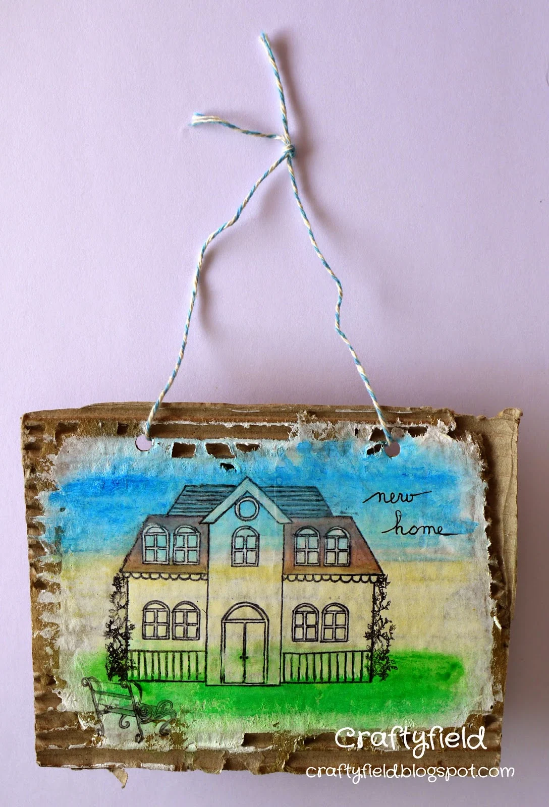
New Home hanging

Not one of my best pieces ... but a good lesson in what NOT to do!

I wanted to use corrugated cardboard as a base for my hanging and Gelatos for the background colours. As Gelatos move a lot better on Gessoed surfaces, I painted a few thin coats before applying the Gelatos, smudging and spraying water.


So far so good... Then I stamped my house. It did not stamp very well at all, not the first time, not the second time! I had to go over all the lines with a pen to make it acceptable. Should have used Stazon or Archival...

I had planned to take off the colour from the house with a brush and water but noooo!! I was taking out the pen lines and not the Gelatos. In the end I left the colour where I could and used my craft knife to take the colour off where it looked the oddest. On the upside this created a sort of grass border at the bottom of the house. Next time I will stamp first and apply the colour after!

I added the bushes and a bench as well as the handwritten sentiment.
As I said, not one of my best pieces, still, I have completed my Craft Barn mission!
Thanks for coming by,


Wednesday, 8 April 2015

Enjoy The Journey

UPDATE: Several of you have had trouble with my explanation with the glass stamping. A video is much better to explain so here's Jennifer McGuire own explanation in images!

Today I am showing a tag that combines several ideas I wanted to play with.
Better warn you this is technique rich but design poor as I kept changing things as and when problems arose!

The Katzelkraft challenge wants us to use stencils so I started with an hexagonal stencil. I hesitated between white acrylic paint which would have given me a resist or white pigment ink and plumped for the latter. This is what gives a faded look to any subsequent layers of Distress (Chipped Sapphire and Forest Moss) as they all get absorbed!

I stamped the car from the Katzelkraft Transportation plate in black and masked the image before over stamping with a variety of images. In white the brick walls from the same set and a wall texture (Prima). With Walnut Distress 1st and 2nd generation of sections of COM004 Time, and the tiny wording from one of the image from The Journey CMS021 set (both Stampers Anonymous).

Finally I tried this technique where a stamp inked with Archival ink is applied to glass which has been alcohol inked. A soft cloth is supposed to remove  all the inks from the glass leaving a transparent impression. This probably works better for organic, bold shapes... I had 2 goes and this is far from perfect but you get the idea...
By the way, I used a piece of mirror as you can see from the left hand photo.
A dash of chicken wire stencilling in black, a bit of inking around the edges, some pencil highlights on the car and a piece of twine finish the tag.


Aujourdh'ui je vous montre un tag qui est le résultat d'une fusion d'idées. Autant vous avertir... il y a beaucoup de techniques mais la composition laisse à désirer à cause de mes changements de cap à chaque problème rencontré!

Le challenge Katzelkraft souhaite que nous utilisions des pochoirs et j'ai commencé avec un pochoir hexagonal. J'ai hesité entre une acrylique blanche, qui aurait donné une technique de resist et une encre pigment, j'ai finalement choisi cette dernière. C'est cette encre qui donne un ton delavé aux couches successives de Distress (Chipped Sapphire et Forest Moss), car elles sont absorbées!
L'automobile de la planche Transportation (Katzelkraft) a été tamponnée en noir et masquée avant de tamponner d'autres images. En blanc le mur en briques, de la même planche,  et une texture "mur" (Prima). Avec de la Distress Walnut les 1eres et 2emes générations de petites sections du tampon Time, et la phrase minuscule d'un des tampons de la planche The Journey (les deux COM004 et CMS021 par Stampers Anonymous).
 
J'ai enfin essayé cette technique où l'on tamponne à l'Archival sur du verre paint au préalable avec des encres à l'alcool.  Un chiffon doux est supposé enlever toute trace d'encres, laissant une "impression" transparente. Cela marche surement mieux avec des motifs plus larges... C'est mon deuxième essai et loin d'être parfait mais bon, vous voyez la technique... J'ai utilisé un morceau de miroir au liey de verre comme vous pouvez voir sur la photo de gauche.

Un soupçon de grillage au pochoir, un peu d'encre sur les bords, quelques traits de crayon blanc pour mettre la voiture en valeur et un bout de ficelle et voilà!

Merci de votre visite,
Thanks for coming by,

Also entering the Vintage Journey, Artful Times and Country View Crafts challenges.

Monday, 6 April 2015

Handmade flowers

Time for a new challenge at Vintage Stamping. The theme this month is Hand made flowers and there are plenty of choices in methods to make your blooms.

I have chosen to use 3 punched flowers, removing 1 petal for the first layer, 2 for the next and 3 for the last layer. The left-over petals make up the centre with layers 4 and 5.


The dancing couple, champagne glasses and champagne bucket all come from the set Woman of Fifties from Flonzcraft.

After stamping the couple in Versafine I coloured their hair using watercolour pencils and the lady's dress with diluted gold acrylic ink over the pencil shading.

Do come and join us in creating hand made flowers, so much cheaper than shop bought! As always, you don't have to create a vintage project, but you DO have to include stamping though - no digis allowed. Our lucky winner will receive a fab prize of a $20 voucher from Flonzcraft so don't miss out on your chance to win!
Go on and hop on over to the Vintage Stamping Challenges blog and see all the DT’s work for more inspiration.

Thanks for coming by,