If you don't know what #3UP is:
At the end of each 4 month blog cycle, Paper Artsy fills the spare week by featuring the work of their followers, generally highlighting their newest releases. The participants are randomly drawn and receive items from the new release to work with.
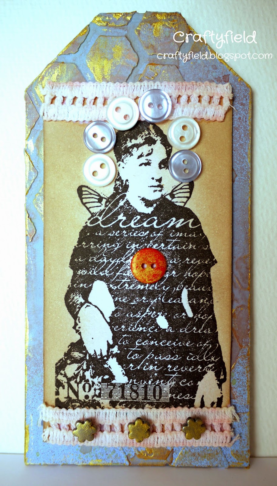
The wait is over, the secret is out... phew I can talk about it!!! Yes.. I was very lucky to be drawn for the #3UP challenge this semester, and today being the Chatsworth Paper Collection blog post, you will gather that this is what I have been working with.
As I had never used the Paper Artsy papers before, I wanted to give the Chatsworth a thorough road test in my project and I can tell you they did live up to the expectation, being as good quality as they appear (they are a hefty 240gsm) and resisting all my (wo)manhandling very well.
I am showing you here a snippet of my project but you must go to the Paper Artsy blog
for the full reveal and catch what my fellow #3Uppers have done tonight.
See you there....
Tuesday, 29 April 2014
Thursday, 17 April 2014
Shabby Chic Attempt
I love the look of Shabby Chic and have attempted the style several times, alas without success, but spurred on by the Pan Pastels UK challenge I though I would try again.
I used fabric and embossing to create texture and the many layers that seem to be the signature of this style.
I think I got the shabby.... not so sure about the chic!
For the background I sprayed through a Prima Doily stencil and embossed a Quatrefoil design on the lower right corner.
I distressed a scrap of paper and stamped it with a Newsprint image.
The larger piece of material has been stamped using Crafty Individuals CI-207 set.
For the smaller one I used the kiss stamping technique with a Harlequin background stamp (The Artistic Stamper) and a flower background. Difficult to see the motif of that second stamp but the effect is pleasant. I sprayed this piece with Pink, Lime and blue patina sprays.
I added a piece of DIY washi tape, coloured staples, a die-cut corner and a border die-cut from fabric that I have gathered with some embroidery floss.
I am also entering the Artful Times, Stamping Sensations, Crafty Individuals and The Artistic Stamper challenges.
Let me know in your comments what you think,
Monday, 14 April 2014
Altered Bottle
I love embossing and I am keen to try new ideas to use with embossing powders. When the Arty Inklings challenged us to alter bottles I knew it was time to try embossing on glass, something I have shied away (for good reason as it turns out).
Yes, glass is slippery and round bottles also make the actual stamping difficult. I tried to roll the bottle on the stamp and the stamp on the bottle and both methods are as awkward as each other.
Still, I declare the embossing distressed so it's all good...
To finish I have stamped a ticket die-cut to write the contents of the bottle or act as a gift tag.
Thanks for coming by,
Saturday, 12 April 2014
Embossed metal
This fortnight the quote challenge at the Craft Barn is for the words Change and/or Truth. Truth be told... but no wait ! I'll save that...
The background must be one of the laziest technique ever. I just dotted small globs of paint in Fresco Claret, Limelight and white, spreading it with a credit card. That's it ! Minimum clean up too...
I used a stencil punched out of card (EK Success) to apply Sparkle Medium in Jade (Imagination Crafts).
Of course this left me more time for my metal frame embellishment, which I die-cut (X-Cut) and then embossed with several embossing powders (Clear, dark green, light green, dark gold and Aged Aqua all different brands). The clear was supposed to create "holes" in the embossing to allow the cream colour of the metal to show through. Obviously I didn't sprinkle enough for it work as intended!
Then, I embossed a border cut from silver metal with a Ten Seconds Studio mold, applied some watered down paint and before it dried poured Clear Holographic embossing powder over it.
The quote is written with sepia ink and a dip pen.
I am also entering the Imagination Crafts and WOW Embossing powder challenges.
Thanks for coming by,
Friday, 4 April 2014
Bright and cheerful
With the temperature going up and nature awakening to spring I fancied a bit of colour as a rest from vintage or grunge. The palette is provided by A Sprinkle of Imagination and I chose Ruby red, Mauve and Pale Lime (plus black and white).
The focal image is from Indigo Blu who have a Spring Blossoms challenge this month.
I used alcohol markers to colour the image, adding a bit of lime watercolour around the image.
The patterned paper is an old magazine freebie and the punched border has been colour matched with the same markers I used on the flowers.
I am also entering My Mum's Craft Shop and Ali Craft challenges.
Thanks for coming by,
The focal image is from Indigo Blu who have a Spring Blossoms challenge this month.

I used alcohol markers to colour the image, adding a bit of lime watercolour around the image.
The patterned paper is an old magazine freebie and the punched border has been colour matched with the same markers I used on the flowers.
I am also entering My Mum's Craft Shop and Ali Craft challenges.
Thanks for coming by,
Sunday, 30 March 2014
Rock Paper (No scissors)
The Craft Barn Quote challenge this week is Flower and/or Travel. I went with the latter and intended to use Rock Paper (yes you read correctly rock paper, paper made from rocks!). This is a paper designed with inkjet printing in mind but I saw someone trying out several mediums with it in a YouTube video. The brand looked different so I couldn't be sure I would get the same results, but I was curious to try... The quote is by Voltaire "Wherever my travels may lead, paradise is where I am", awfully optimist...
I tried watercolours first, in this case I used Neocolor crayons, and applied water with a brush, the wet paint dripped slightly when I stood up the card to produce an interesting effect. The paper doesn't absorb water like standard card does but does not damage it either.
I stamped my world map with Versafine black and painted the countries with a small brush and Neocolors. Further images were stamped with glue and I applied foils in several colours for metallic touches.
I penned the quote in silver gel pen and created shadows with a black pen.
I tried water based and alcohol based markers on this surface and the paper absorbed the ink so fast any blending was impossible. Curiously, I was able, by brushing vigorously, to shift and blend the Faber Castell PITT pen (India ink).
I also tried pastels but they just glided on the surface.
I had fun and discovered interesting properties about this paper that might come in handy...
A quick look at the shine :
I am also entering my page in the Pan Pastel UK challenge.
Thanks for coming by,

Saturday, 29 March 2014
Inspired BY Pam Thorburn (3)
Pam is back on the PaperArtsy blog this week and had a play with the gorgeous Chatsworth papers.
As soon as I saw her layout I knew I had to make one of my own; well that and the fact I have a stack of photos waiting...
s I followed Pam's step by step so I will give here details of where I diverted:
My backing paper is an unloved scrapbook paper that I painted white around the sides, just enough to knock back the printed motif and the dark brown colour.
The main paper started as a dark red 12x12 with an all over damask pattern. I used stamps with pigment inks to ape the Chatsworth papers feel, applying pastels on top where it took my fancy. I also stamped the Reflection stamp (ESN07 stamp set) in dye inks in a few places but a lot of this disappeared behind the photo.
My embellishments are different of course and I spent an inordinate amount of time trying to create with dies my metallic lacy flowers. I didn't count the number of passes or shims combinations I tried but it was A LOT!
For texture I used 2 stencils instead of one, I had the chicken wire but in the smaller size so decided to add the hexagons as they are the right size. I coloured the stencilled areas after they dried because I wasn't happy with the green colour I had originally mixed.
Finally, I couldn't quite push myself to include as many embellishments that Pam did! In my defense, I thought pearls would look a bit odd teamed with a "man"'s photo...
Don't be shy tell me what you think,
Friday, 21 March 2014
Spring is here...
Digital images are becoming more and more popular as is digital crafting or hybrid crafting. Personally I like handling my stamps directly and not being restrained in my techniques either by the ink used or the surface I am stamping onto. Still, I can see the appeal and thought I would better try for myself.
Uniko Studio provided freebies to enter their Hello Spring challenge and I selected the Simple Bloom flower and a speech bubble and sentiment. Using photo editing software I combined them and printed the resulting image on smooth cardstock.
For colour scheme I followed the Pan Pastel challenge to use 6 colours and used the palette below, also proposed on the Uniko Studio:
As a background I wanted to use a stencil I made with a Memory box die and initially thought I would use Distress inks but in the end I didn't have enough colours. Instead I used Versamark and applied pastels over it gradating from the darkest blue to the lightest and vice versa for the green.
I over stamped with the 3 Dandelions stamps (Lavinia) in black Versafine and coloured the printed image with coloured pencils.
With hindsight I wish I had done the green gradation lighter or even faded it out to the bottom and I feel the dandelions are not best placed but I do like the fact it is only one layer.
Don't hesitate to suggest improvements in your comments!
Uniko Studio provided freebies to enter their Hello Spring challenge and I selected the Simple Bloom flower and a speech bubble and sentiment. Using photo editing software I combined them and printed the resulting image on smooth cardstock.
For colour scheme I followed the Pan Pastel challenge to use 6 colours and used the palette below, also proposed on the Uniko Studio:


As a background I wanted to use a stencil I made with a Memory box die and initially thought I would use Distress inks but in the end I didn't have enough colours. Instead I used Versamark and applied pastels over it gradating from the darkest blue to the lightest and vice versa for the green.
I over stamped with the 3 Dandelions stamps (Lavinia) in black Versafine and coloured the printed image with coloured pencils.
With hindsight I wish I had done the green gradation lighter or even faded it out to the bottom and I feel the dandelions are not best placed but I do like the fact it is only one layer.
Don't hesitate to suggest improvements in your comments!
Imagination in Bloom
This is the theme for this month's Imagination Crafts challenge.
Since breaking my paper record in one of my most recent posts I thought I would use papers again but in a more restrained fashion. This time, I pulled out a Melissa Frances pad, freebie in one of the magazine, and opened it for the first time.
I used the Victorian Rose block from Impression Obsession stamp for the image, inked it with Versamark. Then I applied Imagination Crafts mica powders (Earthtones set, not sure if this is still sold) using shades of red for the petals and green for the leaves. With such a detailed stamp and with transparent Versamark on white cardstock it is not easy to actually see what is leave and what is petal so the colouring is not perfect. But it shines!
The photo is not very good, it's a cloudy day, and there is a glare at the top of the image which hides the motif somewhat. Trust me in real life, although subtle, the colours are there!
I added a die-cut mat in kraft cardstock to my sentiment and added pearls to finish.
So there you are something classic, soft and feminine for Mother's day...
Since breaking my paper record in one of my most recent posts I thought I would use papers again but in a more restrained fashion. This time, I pulled out a Melissa Frances pad, freebie in one of the magazine, and opened it for the first time.

I used the Victorian Rose block from Impression Obsession stamp for the image, inked it with Versamark. Then I applied Imagination Crafts mica powders (Earthtones set, not sure if this is still sold) using shades of red for the petals and green for the leaves. With such a detailed stamp and with transparent Versamark on white cardstock it is not easy to actually see what is leave and what is petal so the colouring is not perfect. But it shines!
The photo is not very good, it's a cloudy day, and there is a glare at the top of the image which hides the motif somewhat. Trust me in real life, although subtle, the colours are there!
I added a die-cut mat in kraft cardstock to my sentiment and added pearls to finish.
So there you are something classic, soft and feminine for Mother's day...
Tuesday, 18 March 2014
Wood embossing
Well I never tried before and I didn't think it was possible... but the DT at WOW Embossing Powders set that very challenge and although I considered a wood grain embossing folder or a wood stamp for the challenge, it seemed like a cop out. It had to be tried right?
So I did and this is what happened:
Not only did it work but I love the look of the warm white (WOW Vanilla powder) against the wood. The stamped image look like real crochet!
I enhanced the colour with Distress inks both before and after embossing.
Keeping it simple I added some Core'dination die-cuts and a topper I have had for ages in my stash.
And if you wonder where I got my wood from... I salvaged it from the bin after eating one of Charlie Bigham's dishes. The wooden tray comes lined with baking parchment so with a bit of luck the tray is totally clean. Of course I only use the flat surface from the bottom and being quite thin it is fragile. Here I backed it up with cardstock to avoid any mishaps!
Enjoy,
Sunday, 16 March 2014
Of Art and Textures
The Craft Barn quote challenge continues with the words Art and Road. Of course I chose Art and had my heart set on this quote "Every artist was first an amateur." by Ralph Waldo Emerson. It lets me think there is hope...
Then I realised the quote didn't actually have the word Art in it!
No great designs here, I just wanted to experiment (i.e play).
First I used Inktense blocks to colour my background, then I used a script stamp with Versafine black.
Using an hexagons stencil I applied Texture paste, gloss medium and an iridescent medium to create 3 different looks. I stamped over some of my texture paste in blue dye ink, but this was somewhat lost in the next step, as I sprayed micas mists over the panel.
Finally I applied roughly some glue to the edges and used gold and silver foil, then to eliminate any residual stickiness I brushed some micas powders in red(ish) and gold.
No stamped image this time, I just wrote the quote and die-cut a label to take centre stage.
I am also entering the Pan Pastel UK challenge.
Saturday, 15 March 2014
Inspired By Teresa Abajo
Although I enjoyed the projects by Julie Ann this week on the Paper Artsy blog, the Green men were too much for me, so I settled on a somewhat smaller project and did this tag inspired by Teresa Abajo. You can find her step by step here.
I followed Teresa's process, using the winged lady from ID02 as my focal image.
Shame my proportions are completely off and the lovely background is pretty much hidden!
I decided I would have a red button since a) it's my last one and b) Ellen Vargo, also a DT member for Paper Artsy swears by a bit of red!
It looks like an "On/Off" button. Maybe that's what makes her fly...who knows!
Thanks for coming by,
Subscribe to:
Posts (Atom)