Thursday, 17 September 2015

Sew Shabby (chic)

Stamping Sensations challenge's theme this month is Sewing inspired, which is my opportunity to test my latest Rubber Dance stamps!
I decided on a shabby chic style with lots of lace motifs which I found on the Live and Love Craft blog.


I used textured paste with a Prima doily stencil on the Kraft background, a printed paper which I punched with a Martha Stewart border punch.
I stamped my dress form on a piece of Prima paper (old collection) and gave it a bit of colour with a pink Gelato. A scrap of tulle and a bit of ribbon creates dress in progress on the dress form.

For embellishments I added real and faux buttons, a doily,  other stamped elements from the same Rubber Dance set and a scrap of gauze.

Thanks for coming by,

Also entering the Polka Doodle , Tando Creative and All Sorts  challenge.

Monday, 14 September 2015

Layout

Before getting on with the post, I wanted to welcome my latest new followers, I am humbled by their interest and not a bit proud!

For the Rubber Dance September challenge we can use any of the previous 12 colour schemes. A no brainer for me, it had to be the June colours since I had made a layout for that month and needed to make the facing page at some point... 


The base is a 12x12 Chatsworth paper (Paper Artsy).
I used 3 of the Mixed Media Thinlit (Tim Holtz/Sizzix) to make the diamonds, hexagons and "pebbles" stencils which I used with paste mixed with blue paint. I then coloured those stencilled areas with acrylic paint to darken the corners.

I used the Diamond Background and Netting texture stamps both from Rubber Dance, with vanilla paint (diamonds) and dark chalk ink (netting).

To tie in with the other page I die-cut the title from the same paper as the previous page.
Hope you like my page,

Also entering the Craft Barn challenge.

Friday, 11 September 2015

Diamond wedding anniverasry

Being the resident crafter in the household, choosing theme, colours and designs for cards is usually left to me.
Not wanting to be late with a 60th Anniversary card for my OH's parents, I created this one without asking for his input. How wrong was I?.... He managed to find fault in every aspect....


First, the shape, because even if it said Diamond anniversary, it didn't stand up very well, second the creases (the heavy weight cardstock cracked abominously when I scored and folded it) and finally he objected to have to write the message on the back. I'd easily concede he was right about the first 2 but I am not aware of any etiquette about the message having to be "inside".
Am I missing something? Please let me know in your comments!

The stamps used are from Flonzcraft and perfect for a couple who got married in the Fifties. The Diamond shape and the gold/silver threads were inspired by this card. But instead of using designer paper I created my metallic threads with foils and spray glue, incredibly easy! I used spare bits of paper to mask around the diamond shape and also a Spellbinders label shape where my sentiment was to go before spraying the glue.

I now need another idea for a 60th anniversary card...


************************************************

Now for an update....
Following your comments on this card, and after laughing at your suggestion to give my OH free run of my craft room for a spot of card making! - as if I want him to know how much stuff I REALLY have....)-

this is what I did :


I cut and scored a new piece of card as before except that I added enough width to "create" a 3rd panel. When opened the panel will reveal the handwritten message (as per OH request). I cut out the back panel (the one with the foil) from the old card and stuck it to the new one so I didn't feel like I had completely wasted my time...
On the plus side the added weight on the back helps the card stands better.


The extra panel offers more crafting surface which I immediately put to use with a "60" as per Chrissie's suggestion, a sentiment and a rick rack shaped stripe of glitter (diamond-ish colour). The "60" shows even when the card is closed whilst the sentiment is hidden by the diamond shape.

And the OH's verdict I hear you ask? Yes he did like it, at least he thought it was "all right" which passes as high praise!


I am entering the WOW Embossing powders and Bunny Zoe's Crafts challenges.

Monday, 7 September 2015

Come and play

Time for our challenge at Vintage Stamping and this month it's my turn to choose the theme. I created a game of Tic Tac Toe just for you!

The rules are simple, you must chose 3 elements in a line, either vertically, horizontally or diagonally to feature in your project.


I chose the last vertical line, namely People, Metal and the colours blue and brown.

I reverse-stamped the gentleman with the bowler hat from the True Gentleman, then stamped him normally to pretend my gentlemen are in conversation. I wasn't too happy with the reverse stamping I had done with the brayer because so much colour was lost in the process it looked too pale, so I stamped the image on a separate piece of paper and transferred it with gel medium.

The Swirl is part of a large flourish stencil by Tim Holtz through which I applied Bistres powders in Blue and Brown on a watercolour panel. The gentlemen were protected with masking liquid during this process.

To finish I added eyelets, I still have lots from when they were all the rage - was that more than ten years ago? - and I am yet to finish a single pack!

I hope you find the Tic Tac Toe grid inspiring and that you will join us over at Vintage Stamping Challenges,  you could win a lovely $20 to spend at the Flonzcraft shop. Remember your make doesn't need to be Vintage but it does need to have some stamping, NO DIGIS allowed!

Thanks for coming by,

I am entering the Penny Black and more and Craft Stamper TIMI   challenges.

Sunday, 6 September 2015

Tim Holtz tag

As a late joiner to the tag craze I was yet  to make one of Tim Holtz's 12 tags... This had to be addressed and today's the day...

As soon as I saw the alcohol inks I had the urge to pull mine out and have a play too. I don't use them often enough and Tim's background looked lovely and bright...
Mine look a bit dull (strangely enough it's the metallic mixatives that dulls down the glossy cardstock) and a bit muddy.


I won't bore you with the details as Tim has a comprehensive step by step but I should mention that:
- I die-cut my stencil with the TH/Sizzix Mixed media thinlit.
- the butterflies are from the Crafty Individuals set CI-437
- I made my metal element by triple embossing a label and stamping into it.
- I used vellum in lieu of frosted film
- I flickered a small paintbrush with black paint as I don't have the Distress marker spritzer.

Thanks for coming by,

Also entering  the Craft Barn, The Artistic Stamper, Polka Doodle and Craft Stamper TIMI challenges.

Sunday, 30 August 2015

More play with gels and sprays

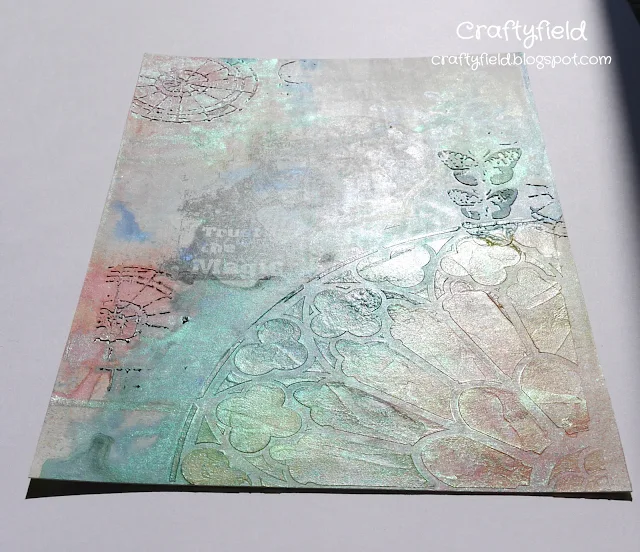
Last week I didn't have time to create a new make for the Paper Artsy challenge using the Paua shell effect technique. The Craft Barn challenge is about sprays this week which I took as a sign...


I used both traditional texture paste and the transparent texture paste from Ranger (in lieu of 3D gel medium) with my stencils and this worked as the micas in my sprays were grabbed quite efficiently by the gel as can be seen in this picture:


I chose my stencils and stamps for their circular motifs with a theme of stained glass.

Thanks for coming by,

 Also entering the We Love 2 Create challenge.

Tuesday, 25 August 2015

Make a wish

Lavinia challenges us to Anything but a card and I decided on a tag cut from some Kraft cardstock. I applied some gesso roughly before stamping 2 of the Lavinia Dandelions.

Like in this project I used micro-glaze as my stamping medium before sprinkling Brusho powder in Ultramarine, my favourite colour, a purply blue. The way Brushos disperse in water reminded me of blowing dandelions heads which led to my faerie doing just that!

I added a hand penned sentiment using watercolour, fancy ribbons and gelatos around the tag to darken the corners.

I also added some Copic Spica shimmer pen in clear on the wings of the faerie and upwards from the blown dandelion head, although with my almost empty pen it's difficult to see....


Thanks for coming by,
Also entering  the Live and Lovecrafts, That Craft Place and Lisa.B.Designs challenges.

Saturday, 22 August 2015

memories

I have been trying to muster enthusiasm to start on a few scrapbooking pages and had a look through my existing layouts (it usually works...) and found this one that just didn't work.

The background had been stamped, embossed with clear powder for a resist effect, sprayed and foiled...
Fortunately, because these are vintage photos, I didn't glue them to the page but used tissue tape to hold them in place so I could easily start again.

First I thought the background colour was too dark so I wanted to add white paint without losing all of the kraft background.
I have been wanting some 3D matt gel but I couldn't get any in the shop and bought the Ranger transparent texture paste, figuring it would be similar. I stencilled it through a Prima/Finnabair doily stencil in 3 places and when dry applied white paint over the paste and embossed areas wiping with a wet rag to reveal the design.

I added a doily die-cut (Prima) and a flower and leaves die-cut (Marianne dies) from metal and painted with acrylics.

Can't say it's perfect but it's definitely better than it was... I have a facing page to be transformed too so I better get to it before I lose interest!

Thanks for coming by,

I am entering  the WOW Embossing Powder and Paper Artsy challenges.

Tuesday, 18 August 2015

Flowers and Diamonds

This fortnight Paper Artsy is exploring acrylic gels and mediums. As a fairly recent acrylic dabbler I am still unsure as to what product to select or how to use, so I was keen to  test some of the ideas published by the DT...

However, I also wanted to try out my new supplies acquired on my holidays, Izinks acrylic inks, and got a bit side tracked from my starting inspiration of Paua shell effect as demonstrated by Lin Brown on the PA blog.

Yes the stencilled gel medium stayed but the sprays made way for the Izinks (no shine), so different altogether. My other use of gel in this project is as transfer medium for a piece of Chatsworth paper one of my favourite technique!


My base panel is gessoed wood, the stencil has been die-cut with Tim Holtz mixed media Thinlits.

I stamped the tulip from the ELB03 set with paint but the impression just wasn't good enough (more practice required for this tricky technique...) and I had to use a fine brush to go over the lines, finishing with coloured pencils.
I added a butterfly die-cut (Impression Obsessions) sprayed with a mica mist and stamped and embossed "Artful Blooms" from the same stamp set.

As to the lustre of the Paua shells... there's always next time!

Also entering the PolkaDoodles, Tando Creative, We Love 2 Create and Stamping Sensations challenges.

Saturday, 15 August 2015

August Butterflies

Time for the August calendar challenge at the Craft Barn.
I used the Rubber Dance colour scheme, perfect for a bright summer's day feel.

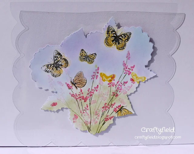
I have made this page on acetate, it is the reverse of the page I did for May, which explains the weird shape of my cardstock.


I used flower stamps from Papertrey ink and the butterflies are from a Crafty Individuals set (CI-231) where I have tried to stamp both "solid" and "line" images on top of each other user a stamp positioner (my paper moved...). I am still in two minds as to whether or not to cut this plate apart, in this instance it would have made my life a lot easier!
I added some green and blue distress inks in the background to round off my garden impression.

As I was writing this post I realised I'd left off the most important part...the calendar, so here is another pic:


Just as well, the calendar manages to hide the more-brown-than yellow butterfly...

Thanks for coming by,

Also entering the Penny Black, Country View (Summertime) and We Love 2 Create challenges.

Thursday, 13 August 2015

Coloured pencils

We are challenged to do some colouring this week for the Craft Barn.
I thought of this stamp of an old car which is perfect for detailed colouring with pencils. I say pencils... I have coloured it with alcohol markers too, but I prefer the control I get with the pencils.


To keep with the masculine feel I kept everything else simple.

Thanks for coming by,

Also entering The Artistic Stamper and Craft Stamper challenges.

Monday, 3 August 2015

#35 Gone Shopping

This month as a lot of us are away on holiday relaxing with limited or no craft stash, Vintage Stamping challenges is having an Anything Goes theme, easy isn't it!


I chose to pull out my 50's Girl with attitude, at least this is what I call her, as she makes me feel positive.
I also used the small image of the 50s lady's legs from the same set.


In a Mixed media mood I combined paints, crackle medium, embossing in Vanilla and Blueberry (WOW powders) for my background.

To stamp my 50's girl images I used waterbased markers and then coloured them with pencils.

I'll admit I took a lot of inspiration from a previous make that I currently use as my phone screen saver. It brings a smile to my face when the phone is activated to see the "Gone Fishing" sign.
You've got to get your fun where you can....
Anyway, I think of this tag as the female equivalent and I might even swap it with my Gone Fishing screen saver!

If you are on holidays, enjoy your time off and don't forget you can enter our Vintage Stamping Challenge with any make, as long as they have some stamping- no digis allowed!


I am entering this tag in the We Love 2 Create, and  That Craft Place challenges.